First Seen
2026-02-27T01:58:21+00:00
simple-description (qwen3.5_2b-q8_0)
Based on the visual evidence in the image, there isn't a single viral "meme" or specific caption for this chart (it is an infographic from Lawrence Livermore National Laboratory), but the data and layout create a humorous or ironic take on urban energy consumption.
For someone who cannot see the diagram, the joke is likely this: "We use almost all of our energy in cities (93.6 Quads), but very little of it actually ends up as usable electricity or services; the vast majority is just wasted heat or 'rejected' by the system."
The infographic visually highlights this paradox through these numbers:
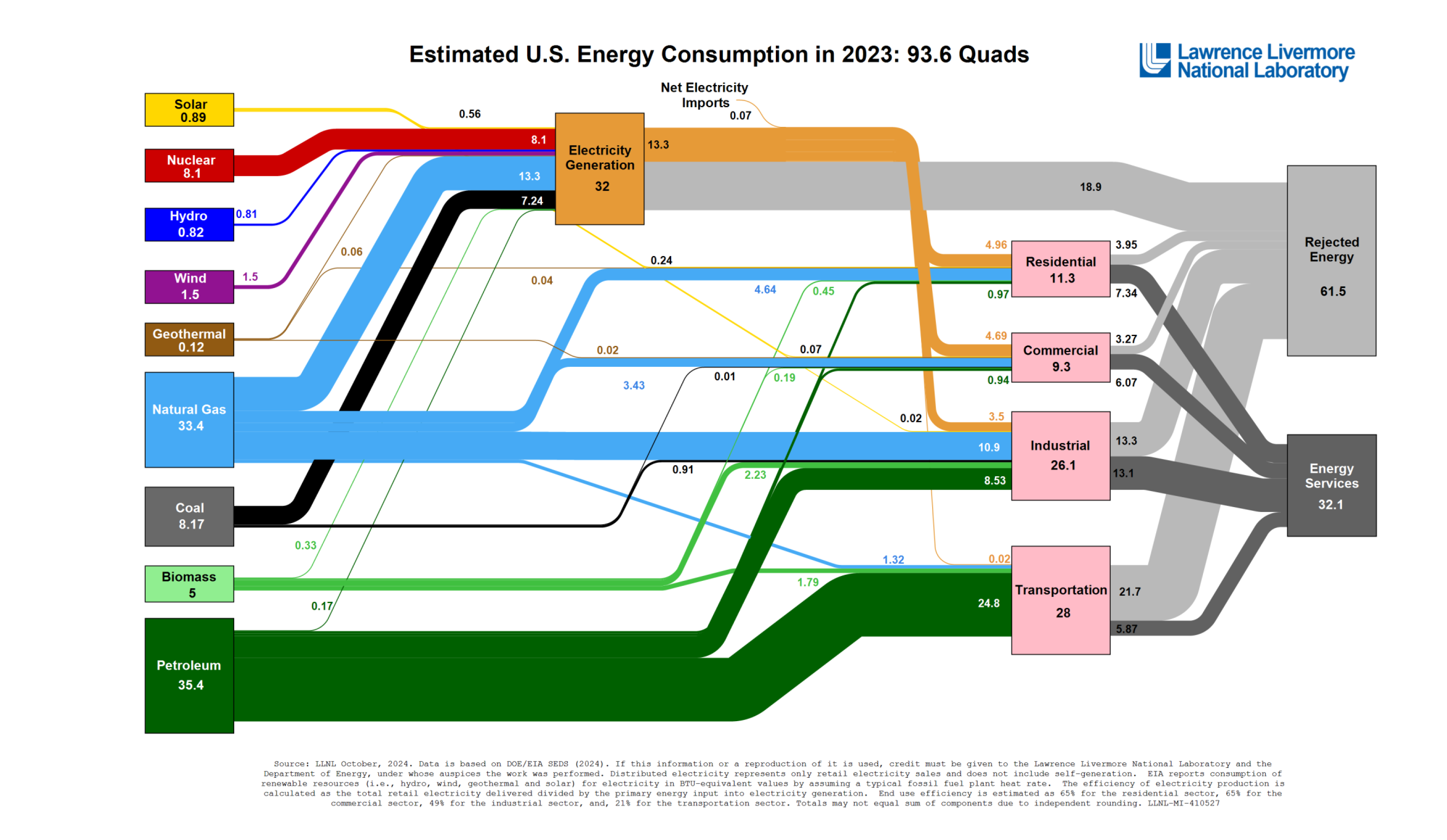
* Total Consumption: The title states "Estimated U.S. Energy Consumption... 93.6 Quads."
* Net Electricity/Services: Only a small box on the far right (labeled "Energy Services" or derived from "Electricity Generation") sums to roughly 32.1 Quads.
* Rejected Energy: A large gray box labeled "Rejected Energy 61.5" sits next to it, meaning that for every 94 units of energy consumed in a city, only about 32 are turned into electricity, and the other ~62 units essentially just "die" as waste or heat (Rejected Energy).
Additionally, the chart humorously displays massive blocks of primary energy sources—specifically Natural Gas (33.4 Quads) and Petroleum (35.4 Quads)—which take up the majority of the visual space, but they only split into relatively small portions of the final sectors, implying that a lot of that fuel ends up burning in waste/heat rather than powering homes or industry efficiently.
detailed-analysis (gemma3_27b-it-q8_0)
Okay, let's analyze this "Estimated U.S. Energy Consumption in 2023" graphic (often informally referred to as a “Sankey Diagram”) through the lens of Urbanism - Energy, touching on relevant theoretical frameworks as appropriate. This analysis will be quite detailed, as requested.
Visual Description
The graphic is a Sankey diagram representing the flow of energy in the United States as of 2023, measured in quadrillions of BTU (British Thermal Units). It visually displays where energy comes from (sources on the left) and where it goes (end-use sectors on the right).
- Sources: The leftmost column lists energy sources: petroleum (35.4), natural gas (33.4), coal (8.7), biomass (5), nuclear (8.1), hydro (0.82), wind (1.5), geothermal (0.12), and solar (0.89). The widths of the colored bands signify the amount of energy contributed by each source.
- Flow: Energy flows from sources through the middle, representing "Electricity Generation" and "Net Electricity Imports", and then splits into different sectors (residential, commercial, industrial, transportation, and energy services). The thickness of the flows demonstrates the magnitude of energy directed to each sector.
- End Uses: The rightmost column shows the final destinations of energy: residential (11.3), commercial (9.3), industrial (26.1), transportation (21.7), and a significant portion is "Rejected Energy" (61.5).
- Key Observations: Petroleum and natural gas dominate the source side. Transportation and "Rejected Energy" are the biggest end-use sectors. Renewable sources (solar, wind, hydro, geothermal) represent a small proportion of the total energy picture, even with the inclusion of Biomass. The diagram highlights massive energy losses ("Rejected Energy"), which are often associated with inefficiencies in conversion and distribution.
Critical Theory
This Sankey diagram presents a stark visualization of the power imbalances embedded within the US energy system. From a Critical Theory perspective, it demonstrates how seemingly neutral technological systems (energy production and consumption) are deeply intertwined with social, political, and economic structures that reinforce existing hierarchies.
- Domination & Control: The massive concentration of energy sourcing on fossil fuels signifies a continued dominance of the fossil fuel industry and the political and economic forces that support it. This dominance perpetuates a system where profit is prioritized over environmental sustainability and social justice.
- Instrumental Reason: The emphasis on maximizing energy output and efficiency (as reflected in the flow) highlights what Critical Theorists like Horkheimer and Adorno call “instrumental reason.” Energy is treated primarily as a means to an end (economic growth, consumption), without sufficient consideration for its broader ethical and ecological implications.
- Colonization of Nature: The extraction of resources (petroleum, natural gas, coal) represents a form of “colonization of nature,” where the environment is seen as a resource to be exploited for human gain. The "Rejected Energy" isn’t simply "waste" but a consequence of this exploitative relationship.
- The Illusion of Choice: While the diagram includes renewables, their relatively small proportion illustrates a limited choice for consumers. The infrastructure and policies largely favor fossil fuels, creating a path dependency that makes transitions to sustainable energy more difficult.
Marxist Conflict Theory
Through a Marxist lens, this diagram can be interpreted as a visual representation of class conflict surrounding the control and distribution of energy resources.
- Means of Production: The energy sources (fossil fuels, nuclear, renewables) represent the "means of production." Control over these means of production is concentrated in the hands of a relatively small number of powerful corporations (e.g., ExxonMobil, Chevron, Duke Energy).
- Exploitation: The extraction of fossil fuels can be viewed as exploitation of both natural resources and the labor of those involved in the industry (often in marginalized communities). The costs of this exploitation (environmental degradation, health impacts) are disproportionately borne by the working class and communities of color.
- Capital Accumulation: The energy system, as depicted here, is fundamentally driven by capital accumulation. The primary goal is not to meet human needs or protect the environment but to generate profit for the owners of the means of production. The "Rejected Energy" represents lost profits.
- Ideology: The emphasis on economic growth and consumerism fueled by energy consumption reinforces a dominant ideology that justifies the current system, even in the face of its negative consequences.
- Contradictions: The diagram reveals the inherent contradictions of the capitalist energy system. For example, the reliance on finite fossil fuels is inherently unsustainable, and the environmental costs of energy production threaten the very foundations of the system.
Foucauldian Genealogical Discourse Analysis
Foucault's work on power/knowledge and discourse is extremely relevant here. This Sankey diagram isn’t a neutral depiction of reality; it’s a product of and contributes to specific discourses about energy.
- Power/Knowledge: The creation of this diagram requires specific knowledge (energy statistics, measurement techniques, visualization methods) which is produced by institutions with power (e.g., Lawrence Livermore National Laboratory). This knowledge, in turn, reinforces existing power relations by defining what counts as “energy,” how it’s measured, and what constitutes “efficiency.”
- Discursive Formation: The diagram participates in a discursive formation around energy, which establishes certain ways of talking and thinking about energy. It normalizes the dominance of fossil fuels, frames “efficiency” as a primary goal, and obscures the social and political factors that shape energy consumption patterns.
- Genealogy: A genealogical analysis would trace the historical development of these discourses. For example, how did the concept of “energy” emerge as a quantifiable entity? How did the emphasis on fossil fuels become dominant? How did the idea of "Rejected Energy" become a concern (or not)?
- Discipline: The framing of the diagram implicitly disciplines our thinking about energy. It focuses attention on technical solutions (efficiency improvements, renewable energy technologies) while often overlooking the deeper structural problems that drive energy consumption.
Postmodernism
A Postmodern reading would challenge the notion of a singular, objective “truth” about energy consumption.
- Deconstruction: The diagram can be deconstructed to reveal its underlying assumptions and biases. For example, the very act of quantifying energy in BTU’s is a simplification of a complex phenomenon. The diagram's aesthetic choices (colors, layout) also shape how we interpret the data.
- Relativism: The “truth” of the diagram is relative to the perspective of those who created it. It reflects the priorities and values of the institutions involved (e.g., a national laboratory with ties to the energy industry).
- Simulacra & Simulation: The diagram itself could be seen as a simulacra - a representation that has become detached from the reality it purports to depict. It's a model of energy flow, not energy flow itself, and can be manipulated or misinterpreted.
- Fragmentation: The diagram, despite its attempt to provide a comprehensive overview, ultimately reveals a fragmented energy landscape. There is no single, coherent narrative about energy consumption; rather, there are multiple competing forces and interests at play.
Queer Feminist Intersectional Analysis
This lens examines how power, privilege, and oppression intersect based on gender, sexuality, race, class, and other social categories within the energy system.
- Unequal Impacts: The consequences of energy production and consumption are not distributed equally. Marginalized communities (particularly communities of color and low-income communities) are disproportionately affected by pollution from fossil fuel extraction, the siting of energy infrastructure, and the impacts of climate change.
- Gendered Energy Labor: The energy sector has historically been dominated by men, and women are often underrepresented in leadership positions. Furthermore, the labor involved in energy production (e.g., coal mining, oil drilling) is often considered “masculine” work, and women may face discrimination and harassment in these industries.
- Environmental Racism: The diagram implicitly reveals the links between energy production and environmental racism. The siting of polluting energy facilities often targets communities of color, exposing residents to health risks and diminishing their quality of life.
- Reproductive Justice: The climate crisis, fueled by fossil fuel consumption, poses a threat to reproductive justice. Climate change can exacerbate existing health disparities, limit access to healthcare, and disrupt reproductive rights.
- Challenging Normative Consumption Patterns: A queer feminist perspective would question the normative assumptions underlying current energy consumption patterns. Are our current energy needs truly essential, or are they driven by unsustainable and oppressive social norms (e.g., car dependency, consumerism)?
In conclusion, the seemingly objective Sankey diagram of US energy consumption is, in fact, a deeply politicized artifact. By applying these diverse theoretical lenses, we can unpack the power dynamics, social inequalities, and ideological forces that shape our energy system and work towards a more just and sustainable future.
simple-description (llama3.2-vision_11b)
The meme is a visual representation of the estimated U.S. energy consumption in 2023, using a flowchart to illustrate the various sources of energy and their relationships. The chart shows that energy is generated from various sources, including solar, nuclear, and wind, and that these sources are used to power various industries, such as transportation, transportation, and energy services. The chart also shows that the energy industry is not just a source of energy, but also a source of energy for the industry, and that it is a source of energy for the industry.