First Seen
2026-02-27T01:56:16+00:00
simple-description (qwen3.5_2b-q8_0)
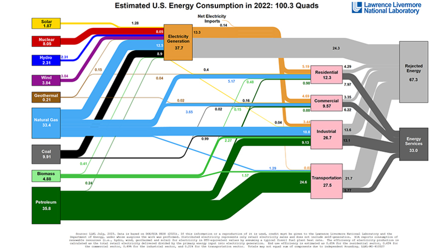
This infographic from Lawrence Livermore National Laboratory tracks the flow of energy consumption, visually mapping how raw sources like coal and natural gas feed into electricity generation. The chart breaks down these inputs—labeled as 100.3 Quads for 2022—into sectors including Residential, Commercial, Industrial, and Transportation, while also noting that "Net Electricity Imports" are included in the calculation.
detailed-analysis (gemma3_27b-it-q8_0)
Okay, let's break down this "Sankey Diagram" of US energy consumption (which is not a meme, but a data visualization) through the lens of Urbanism - Energy, and with the requested theoretical frameworks where relevant.
Visual Description
The image is a Sankey diagram illustrating the flow of energy in the United States for 2022. Energy sources (on the left) – petroleum, natural gas, coal, biomass, wind, solar, hydro, geothermal, and nuclear – are represented as streams with widths proportional to their quantity (measured in Quads, a unit of energy). These streams flow through the middle, representing energy sector processes (specifically, electricity generation), and then diverge into end-use sectors – residential, commercial, industrial, and transportation. A significant portion of the energy is depicted as "Rejected Energy" (wasted energy) at the far right. Key observations:
- Dominance of Fossil Fuels: Petroleum, natural gas, and coal constitute the majority of energy sources.
- Electricity Generation as a Hub: Electricity generation acts as a central node, receiving energy from various sources and distributing it.
- High Rejection Rate: A very substantial amount of energy is lost as "rejected energy" – indicating inefficiencies throughout the system.
- Sectoral Differences: The proportions of energy sources utilized by each end-use sector vary significantly. Transportation is almost entirely dependent on petroleum.
- Renewable Role: Renewable sources (solar, wind, hydro) represent a small but growing proportion of the total.
Foucauldian Genealogical Discourse Analysis
Michel Foucault's genealogical method examines how power relations are produced and maintained through discourse. This diagram reveals how the discourse of energy has been historically constructed around resource extraction, industrial production, and consumptive patterns.
- Power/Knowledge: The diagram is an exercise of power/knowledge. It's produced by a national laboratory (Lawrence Livermore), legitimizing a particular way of understanding and quantifying energy. This framing implicitly accepts the existing system as a rational, calculable entity – rather than questioning its foundations. The metric of “Quads” itself is a choice, framing energy in terms of quantity rather than other metrics like environmental impact or social justice.
- Disciplinary Mechanisms: The emphasis on “rejected energy” isn’t a simple matter of efficiency. It implies a disciplinary regime where energy "waste" is seen as a problem to be managed and optimized within the existing system, rather than a symptom of an unsustainable model. This focuses efforts on technical fixes rather than systemic change.
- Historical Contingency: A genealogy would trace how this pattern emerged. The dominance of fossil fuels isn’t natural; it’s a result of specific historical decisions about infrastructure (roads built for cars, power plants fueled by coal), political-economic forces (the rise of the oil industry), and technological choices.
- Normalizing Effects: The diagram normalizes the massive scale of energy consumption and the dependence on finite resources. It presents it as a given, rather than as a site of contestation.
Critical Theory
Critical theory, rooted in the Frankfurt School, critiques systems of domination and seeks to reveal underlying power structures.
- Instrumental Rationality: The diagram exemplifies what critical theorists like Horkheimer and Adorno termed “instrumental rationality” – the tendency to assess everything solely in terms of its usefulness and efficiency. The focus on quantifying energy and minimizing “rejected energy” reduces the complex relationship between humans and the environment to a technical problem. There's little space for questions of value, ethics, or the desirability of certain forms of consumption.
- Commodification of Nature: The energy sources themselves (fossil fuels, uranium, wind, sunlight) are reduced to commodities, quantifiable and subject to market forces. This reinforces the commodification of nature, a central critique of critical theory.
- System Justification: The diagram can be seen as implicitly justifying the existing system. By presenting the flow of energy as a logical process, it obscures the social and ecological costs associated with it.
- Ideology: The diagram's apparent objectivity masks a particular ideological standpoint – one that favors continued economic growth and technological innovation within the existing capitalist framework.
Marxist Conflict Theory
From a Marxist perspective, the diagram reveals the contradictions inherent in a capitalist energy system.
- Means of Production: The energy sources (oil wells, coal mines, power plants) represent the “means of production.” Control over these resources is concentrated in the hands of a relatively small number of corporations, creating a power imbalance.
- Class Relations: The diagram reflects the class relations inherent in energy production and consumption. The benefits of cheap energy are unevenly distributed, with the working class bearing the brunt of environmental pollution and energy costs, while capital accumulates profits.
- Contradictions of Capitalism: The “rejected energy” represents a fundamental contradiction of capitalism – the tendency to overproduce and waste resources in the pursuit of profit. It’s a manifestation of the system's inability to rationally plan for long-term sustainability.
- Exploitation of Labor & Nature: The extraction of fossil fuels and the operation of power plants involve the exploitation of both human labor and natural resources.
- Resource Wars & Imperialism: The dependency on petroleum is linked to geopolitical struggles and imperialist interventions to secure access to resources.
Postmodernism
A postmodern reading would challenge the diagram's claim to objective representation and emphasize the constructed nature of knowledge.
- Deconstruction of Grand Narratives: The diagram perpetuates a “grand narrative” of progress through technological innovation. A postmodern analysis would deconstruct this narrative, highlighting the uncertainties and ambiguities inherent in energy systems.
- Relativism & Fragmentation: Postmodernism would question the idea of a single, unified “energy system.” Instead, it would emphasize the fragmented and localized nature of energy production and consumption. Different communities experience energy in radically different ways.
- Simulation & Hyperreality: The diagram itself is a simulation of reality – a simplified representation of a vastly complex system. This raises questions about the relationship between representation and reality.
- Focus on Discourse: Postmodernism would focus on the language used in the diagram (e.g., "rejected energy") and how it shapes our understanding of the issue.
Queer Feminist Intersectional Analysis
This approach centers marginalized experiences and challenges heteronormative and patriarchal power structures.
- Unequal Impacts: The diagram doesn't show who bears the costs of the energy system. Feminist analysis would reveal that marginalized communities (low-income communities, communities of color, Indigenous populations) are disproportionately affected by pollution, environmental degradation, and energy poverty.
- Gendered Dimensions: Energy access and affordability often have gendered dimensions. Women may be more likely to experience energy poverty due to lower wages and greater caregiving responsibilities. The energy industry also historically excludes women from positions of power.
- Intersectionality: The effects of the energy system are compounded by intersecting forms of oppression (race, class, gender, sexuality). For example, a Black woman living in a low-income neighborhood may be particularly vulnerable to the negative impacts of fossil fuel pollution.
- Challenging Normative Consumption: Queer perspectives would question the normative assumptions about consumption that underpin the energy system. What would a more sustainable and equitable energy future look like if it were based on principles of care, interdependence, and de-growth?
In conclusion: This seemingly straightforward diagram is a rich site of analysis, revealing power dynamics, ideological assumptions, and social inequalities embedded within the US energy system. It is far more than just a data visualization; it's a representation of a complex socio-technical system shaped by history, politics, and cultural values.
simple-description (llama3.2-vision_11b)
The meme is a visual representation of the estimated U.S. energy consumption in 2022, broken down into various categories. The image is a flowchart-like diagram with different colors and lines representing different types of energy sources, such as solar, nuclear, and natural gas. The text at the top of the image reads: "Estimated U.S. Energy Consumption in 2022: 1.1 Billion" and the categories include: "Solar: 1.87", "Nuclear: 8.05", "Hydro: 2.31", "Wind: 3.64", "Geothermal: 0.21", "Natural Gas: 33.4", "Coal: 9.91", "Biomass: 4.88", "Petroleum: 35.8", and "Other: 1.29".
From the perspective of urbanism and energy, this meme is a visual representation of the various energy sources and their contributions to the U.S. energy consumption in 2022. It highlights the importance of different energy sources, such as solar, nuclear, and natural gas, and the role of other energy sources such as biomass and other energy sources. The meme is a visual representation of the U.S. energy industry, and it can be used to understand the various energy sources and their contributions to the U.S. energy industry.