First Seen
2026-02-27T01:55:26+00:00
simple-description (qwen3.5_2b-q8_0)
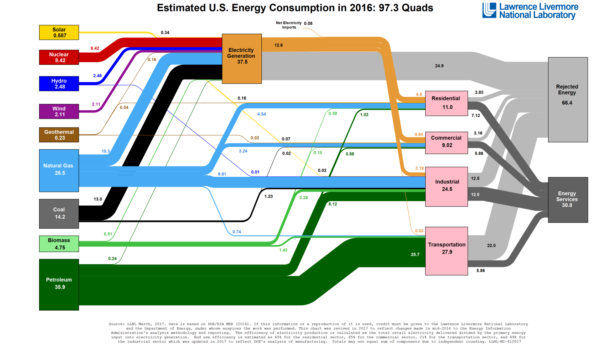
Based on the category context Urbanism - Energy, the meme visualizes how dense city environments create massive inefficiencies in energy usage.
The graphic shows that while a vast amount of primary energy (97.3 Quads) is consumed to power cities—including heating, ventilation, and air conditioning (HVAC) for skyscrapers and dense housing—the majority of that generated electricity ends up as "Rejected Energy". In an urban context, this represents the sheer volume of waste heat produced by massive cooling systems in hot weather or heating pipes in cold climates. Essentially, it highlights that cities are "power hogs," but a significant chunk of their electricity (over 60 Quads out of every 97) is simply lost or rejected rather than used for productive work like lighting or appliances.
detailed-analysis (gemma3_27b-it-q8_0)
Okay, let's analyze this Sankey diagram of U.S. Energy Consumption in 2016 through the lens of Urbanism - Energy, utilizing the requested theoretical frameworks where relevant.
Visual Description
The image is a Sankey diagram, a flow-based visualization, created by Lawrence Livermore National Laboratory. It illustrates the flow of energy in the United States in 2016, quantified in Quads (Quadrillion BTU).
- Sources (Left Side): The left side depicts primary energy sources – petroleum, natural gas, coal, biomass, wind, hydro, nuclear, geothermal, and solar. Their relative widths correspond to the amount of energy they contribute (Petroleum is dominant, followed by Natural Gas and Coal).
- Flows: The bands represent the flow of energy from source to sector. The wider the band, the greater the energy transfer.
- Sectors (Right Side): The right side shows the end-use sectors – residential, commercial, industrial, transportation, and energy services.
- "Rejected Energy" (Far Right): A large, prominent band labeled "Rejected Energy" (66.4 Quads) consumes a massive portion of the total energy. This represents energy lost as waste heat during the conversion and use processes.
- Electricity Generation (Center): A central node representing electricity generation acts as a hub, receiving energy from several sources and distributing it to sectors.
- Color Coding: Different colors represent different energy sources, facilitating visual tracking of energy flows.
Key Observation: The diagram immediately reveals the massive scale of energy loss and the dominance of fossil fuels. It also highlights the significant portion of energy going into transportation, and the importance of electricity generation as an intermediary step.
Foucauldian Genealogical Discourse Analysis
From a Foucaultian perspective, this diagram isn't just a neutral representation of energy facts; it's a discourse embodying and reinforcing a particular power/knowledge regime regarding energy.
- Historical Formation: This diagram represents a specific moment in the historical formation of energy discourses. The act of quantifying energy, categorizing its sources and uses, and representing it visually as a flow is a modern/Enlightenment practice. It allows for a certain kind of ‘governance’ of energy – planning, regulation, and optimization.
- Power/Knowledge: The data itself (generated by the Lawrence Livermore National Laboratory, a state-aligned institution) creates the reality it depicts. The very categories used (e.g., “Rejected Energy”) define what is considered valuable and what is not. "Rejected Energy" isn't a natural category; it's a constructed one that frames energy loss as an inevitable byproduct of the system.
- Normalization: The diagram normalizes the dominance of fossil fuels. By presenting this as “the way things are,” it obscures the historical and political processes that led to this dependence. It also normalizes "Rejected Energy" as a necessary loss.
- Disciplinary Effect: The diagram implicitly suggests that the solution lies in optimizing the existing system – reducing waste and making the flows more efficient. It does not necessarily question the fundamental structures of energy demand or the logic of growth.
Critical Theory
Drawing on Critical Theory (particularly the Frankfurt School), we can interpret this diagram as reflecting the broader societal ills of late capitalism.
- Instrumental Reason: The diagram embodies "instrumental reason," a focus on efficiency and control without considering ethical or social consequences. The emphasis on optimizing energy flows and reducing "rejected energy" illustrates a purely technical approach, devoid of broader value judgments.
- Commodification of Nature: Energy is presented as a resource to be extracted, transformed, and consumed. This reinforces the commodification of nature, reducing it to a means for economic production.
- Repressive Rationality: The focus on quantification and optimization can be seen as a form of "repressive rationality." While appearing objective, it serves to maintain the status quo and suppress alternative ways of thinking about energy (e.g., degrowth, radical energy democracy).
- Alienation: The diagram's abstract representation of energy obscures the real-world impacts of energy production and consumption – environmental destruction, social inequalities, and geopolitical conflicts. This contributes to a sense of alienation from the ecological and social processes that sustain our lives.
Marxist Conflict Theory
From a Marxist perspective, this diagram reveals the inherent contradictions and power dynamics within the capitalist energy system.
- Means of Production: The energy sources (fossil fuels, renewables) represent the "means of production" – the resources controlled by capitalist entities. The dominance of fossil fuels points to the power of established energy corporations.
- Class Struggle: The diagram highlights the unequal distribution of energy benefits and burdens. While all sectors benefit from energy, the costs (environmental damage, health impacts) are often disproportionately borne by working-class communities.
- Accumulation of Capital: The entire system is driven by the accumulation of capital. Energy is produced and consumed not to meet human needs, but to generate profit for corporations. "Rejected Energy," although framed as a loss, can be seen as an inherent part of the system, as continuous production and consumption are necessary for capital accumulation.
- Contradictions: The "Rejected Energy" category represents a fundamental contradiction of capitalism – the need for continuous growth leading to unsustainable waste. It points to the inherent limitations of a system based on endless expansion.
Postmodernism
A Postmodern reading would challenge the diagram's claim to objective truth and question the very notion of a unified "energy system."
- Deconstruction of Grand Narratives: The diagram presents a seemingly coherent narrative of energy flow. A postmodern approach would deconstruct this narrative, highlighting its internal contradictions, power biases, and the impossibility of a complete and objective representation.
- Relativism: The diagram privileges certain forms of knowledge (scientific quantification) while marginalizing others (Indigenous ecological knowledge, experiential understanding). Postmodernism would emphasize the relativity of knowledge and the importance of multiple perspectives.
- Simulacra & Simulation: The diagram itself could be seen as a "simulacra" – a representation that has become detached from its original referent. The abstract categories and flow lines create a simplified, idealized version of a complex reality.
- Fragmentation: The diagram’s categories, while useful, inherently fragment a more holistic understanding of energy and its relationships to social, political, and ecological systems.
Queer Feminist Intersectional Analysis
This perspective examines how power operates through the intersections of gender, sexuality, race, class, and ability within the energy system.
- Energy Inequalities: The diagram doesn't reveal the who behind the energy consumption. Energy access and the burdens of pollution are not evenly distributed. Women, people of color, and low-income communities are disproportionately affected by energy poverty, environmental racism, and the impacts of fossil fuel extraction.
- Gendered Labor: The diagram overlooks the gendered division of labor within the energy sector. Traditional energy industries are dominated by men, while care work (related to energy access and affordability) is often performed by women.
- Queer Ecology: A queer ecological perspective challenges the heteronormative assumptions embedded in energy systems. The emphasis on linear flows and rigid categories reflects a desire for control and order that mirrors patriarchal and colonial power structures. A queer ecology would embrace complexity, fluidity, and the interconnectedness of all life forms.
- Intersectionality: The impacts of energy systems are experienced differently depending on individuals’ intersecting identities. For example, a low-income, Black woman living near a coal-fired power plant faces a unique set of vulnerabilities.
In conclusion: This Sankey diagram, while seemingly objective, is deeply embedded in a complex web of power relations, historical discourses, and social inequalities. Examining it through these theoretical lenses reveals the limitations of a purely technical approach to energy and the need for a more just, equitable, and sustainable energy future.
simple-description (llama3.2-vision_11b)
The meme is an image of a complex flowchart showing the estimated U.S. energy consumption in 2016, with various energy sources and their corresponding percentages. The image is titled "Estimated U.S. Energy Consumption in 2016: 97.3 Quads" and features a network of colorful lines and nodes representing different types of energy sources, such as solar, nuclear, and fossil fuels. The image also includes a legend explaining the various colors and symbols used to represent different types of energy sources.