First Seen
2025-09-29T16:40:46+00:00
simple-description (qwen3.5_2b-q8_0)
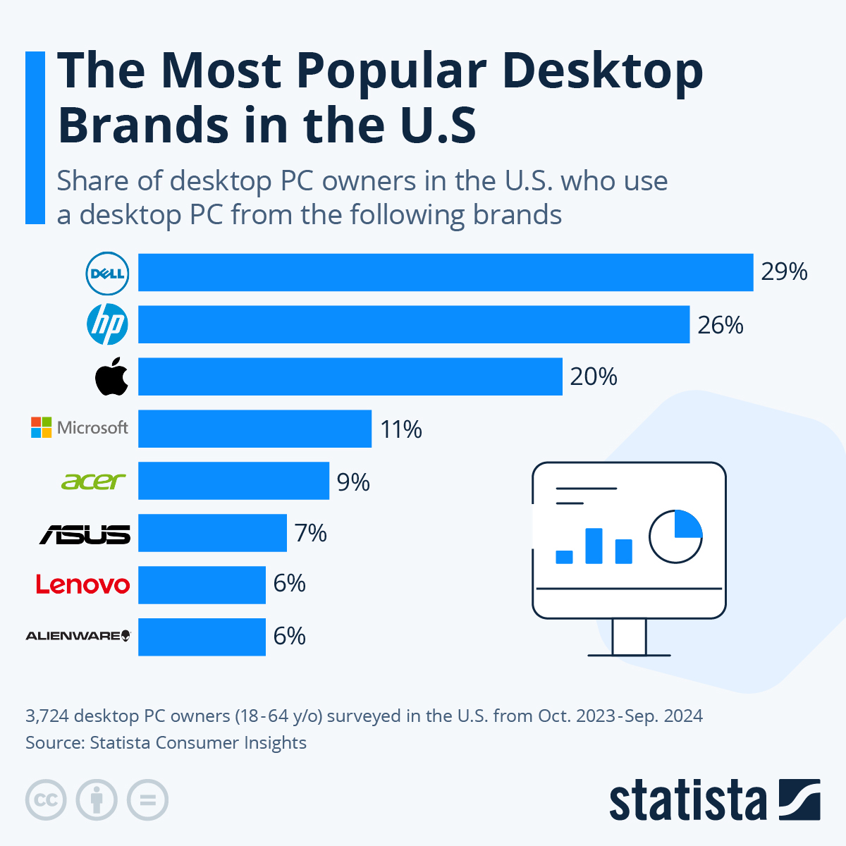
This is an infographic that functions as a "data meme"—a visual breakdown analyzing which desktop computer brands dominate the US market. It uses horizontal bars to illustrate the specific percentage share held by major players like Dell at 29% and HP at 26%. The chart also includes explanatory text detailing the survey source (Statista Consumer Insights) and the dates from which the data was collected.
detailed-analysis (gemma3_27b-it-q8_0)
Okay, let's break down this "meme" – which is actually a data visualization from Statista on desktop PC brand market share in the US – through various critical lenses pertinent to the Technology category. It's important to remember we're applying frameworks often used to analyze culture to data, which is itself a cultural artifact.
Visual Description
The graphic is a horizontal bar chart displaying the percentage of US desktop PC owners who use a particular brand. The brands listed are Dell (29%), HP (26%), Apple (20%), Acer (9%), ASUS (7%), Lenovo (6%), and Alienware (6%). Each brand is represented by a different color horizontal bar, with the length proportional to its market share. The graphic is clean and uses easily recognizable brand logos. A circular loading symbol is placed to the right of the bars, which is a visual reference to computing (loading, processing). The data is sourced from a Statista Consumer Insights survey of 3,724 desktop PC owners (ages 18-64) conducted between October 2023 and September 2024.
Foucauldian Genealogical Discourse Analysis
Michel Foucault’s work on discourse and power is extremely relevant here. This chart isn’t just about "popularity"; it's a construction of knowledge about the market. It represents a discourse that shapes perceptions of the PC market.
- Power/Knowledge: The act of measuring and ranking these brands produces a particular truth about their value. This truth isn't inherent, but constructed by the methodology of the survey and the way the data is presented. Statista, as the author of this discourse, wields power by defining what "success" looks like in this market (market share).
- Genealogy of the PC: Tracing the "genealogy" of the PC (its historical development) would reveal that market dominance wasn't always this way. IBM once held an overwhelming share. The rise and fall of brands are tied to shifts in technology, marketing, and consumer preferences. This chart is a snapshot in that continuing historical process.
- Disciplinary Effects: The visualization has disciplinary effects on the brands themselves. Being at the top (Dell, HP) reinforces their position, incentivizing them to maintain strategies that keep them there. Brands at the bottom are pressured to adapt or risk marginalization.
Critical Theory (Frankfurt School)
From a Critical Theory perspective, this chart exposes how technological rationality has come to dominate our lives.
- Instrumental Reason: The emphasis on market share reflects an "instrumental reason" – a focus on efficiency and measurable outcomes. The quality of the PCs themselves (durability, user experience, ethical sourcing of materials) are not directly addressed. It is simply about "how many".
- Culture Industry: The PC market, as reflected in this chart, is part of a larger "culture industry" that produces standardized goods. While there are variations between brands, there's a fundamental sameness in their function: to serve the capitalist system.
- Commodification: The chart emphasizes the commodification of computing. PCs are not viewed as tools for creativity or knowledge, but as products to be bought and sold. The brands become symbols of status and consumer choice, contributing to a society driven by consumption.
Marxist Conflict Theory
Looking at this through a Marxist lens, we see the inherent class struggles and contradictions within the technology market.
- Capital Accumulation: The competition between these brands is fundamentally about capital accumulation – the drive to maximize profit. The brands are in constant conflict, vying for a larger share of the market.
- Means of Production: The ownership of the "means of production" (the factories, the design processes, the technology) is concentrated in the hands of a few corporations. This leads to an imbalance of power and the potential for exploitation of labor in the supply chain.
- False Consciousness: Marketing and branding contribute to “false consciousness,” where consumers are led to believe that owning a particular brand will improve their lives, obscuring the underlying exploitation and inequalities. The circular loading symbol, while relatable, could be seen as a sign of the never-ending cycle of needing to upgrade to keep up with the capitalist demand for more.
Postmodernism
A postmodern reading focuses on the constructed nature of reality and the fragmentation of meaning.
- Simulacra & Simulation: The branding itself can be seen as a "simulacrum" – a copy without an original. The meaning of a brand (e.g., "Dell is reliable") is often based on marketing and advertising, rather than inherent quality.
- Deconstruction: One could "deconstruct" the idea of "popularity" itself. What does it mean to be "popular"? Is it a meaningful measure of value? The chart presents a single, seemingly objective metric, but it's open to interpretation.
- Rejection of Grand Narratives: This chart rejects any "grand narrative" about technology's progress. It is simply a moment in time, a snapshot of consumer preferences, devoid of inherent meaning or direction.
In Conclusion:
This data visualization is much more than just a list of brand rankings. It's a cultural artifact that reveals power dynamics, economic forces, and the ways in which technology is shaped by (and shapes) society. Applying these critical lenses helps us move beyond a superficial understanding of the "most popular" brands and examine the underlying structures that create and maintain this "popularity."
simple-description (llama3.2-vision_11b)
The meme is a chart showing the share of desktop PC owners in the US who use a desktop PC from various brands. The chart lists the top 7 brands, with Dell having the largest share at 29% followed by HP at 26%, and Apple at 20%. The chart is humorous because it implies that Dell is the most popular brand for desktop PCs, which is not necessarily a surprise given the company's long history of producing high-quality desktop PCs.