First Seen
2023-05-10T21:03:40+00:00
simple-description (llama3.2-vision_11b)
The meme is a humorous illustration of a statistical concept called sampling bias. It shows a researcher presenting a survey to a group of people, with a chart displaying the results. The chart shows that 99.9% of respondents love the survey, but the researcher is only showing the 0.1% who didn't. The text below the chart reads, "We found that 99.9% of respondents loved the survey, but we only showed you the 0.1% who didn't."
detailed-analysis (gemma3-27b-vision)
Okay, let's break down this cartoon, applying the requested theoretical lenses where applicable.
1. Visual Description
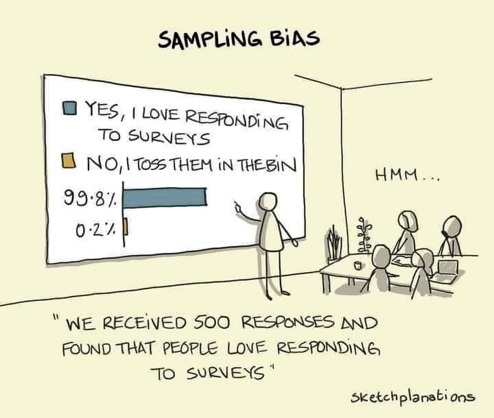
The cartoon depicts a brightly lit conference room. A figure (presumably a presenter) stands beside a large screen displaying a bar graph. The graph demonstrates that 99.8% of people “love responding to surveys,” while only 0.2% “toss them in the bin.” However, positioned behind the presenter, just visible through a doorway, is a large bin overflowing with surveys.
Around a conference table sit several figures, implied to be an audience. One is audibly murmuring “Hmm…”. This indicates skepticism or quiet questioning. The overall style is minimalist, with simple line drawings and a pale yellow background. The caption at the bottom reads: “We received 500 responses and found that people love responding to surveys.” The cartoon is labeled "Sampling Bias".
2. Foucauldian Genealogical Discourse Analysis
This cartoon strongly lends itself to a Foucauldian analysis. Foucault was interested in how power operates through discourse and how this creates "truths" and "knowledges."
- Power/Knowledge: The cartoon illustrates how a seemingly neutral act – conducting a survey – can be a tool of power. The presenter is constructing a reality ("people love surveys") based on a flawed method, and presenting it as objective truth. The knowledge produced (that people love surveys) isn’t organic, but produced through the selective inclusion/exclusion of data.
- Genealogy: The cartoon implies a historical trajectory of survey methods. It suggests how surveys have come to be accepted as legitimate ways of gathering information, masking the inherent biases. A genealogical investigation would trace how surveys became established as a "truth-telling" practice, and what assumptions underpin their legitimacy.
- Discipline & Normalization: The presenter’s confident assertion and the audience's hesitant "hmm..." hint at a subtle form of disciplinary power. The presenter attempts to normalize the idea that people enjoy surveys, despite the visual evidence to the contrary. The act of presenting flawed data reinforces a specific narrative.
3. Critical Theory
This cartoon is entirely within the realm of Critical Theory. The central idea of Critical Theory is to critique systems of power and expose hidden ideologies.
- Ideology: The survey results presented are a clear example of ideological manipulation. The presenter is presenting a distorted reality as if it were objective truth. This can reinforce a particular worldview (e.g., that data collection is unbiased or that public opinion is easily captured).
- The Enlightenment Project Critique: The cartoon can be seen as a critique of the Enlightenment faith in rationality and objective knowledge. The survey attempts to be rational and scientific, but it is fundamentally flawed, revealing the limits of “objective” data.
- False Consciousness: The audience’s hesitant “hmm…” suggests they are beginning to perceive the manipulation. They are resisting the presenter's attempt to impose a false consciousness – the acceptance of a distorted reality as truth.
4. Marxist Conflict Theory
While not the primary lens, there is a subtle application of Marxist thought here.
- Power Dynamics: The presenter and audience represent a power dynamic. The presenter holds the authority to present data and shape perceptions. The audience is in a position of relative powerlessness, potentially being influenced by the flawed information.
- Concealment of Material Conditions: The overflowing bin represents the "hidden" reality – the vast majority of people reject the surveys. The presenter is concealing this material condition (the true response rate) to construct a more favorable narrative.
- Dominant Ideology: The presented "truth" (that people love surveys) can be interpreted as reinforcing a dominant ideology that values data-driven decision-making, even when that data is skewed or manipulated.
5. Postmodernism
Postmodernism emphasizes the subjectivity of truth and the deconstruction of grand narratives.
- Rejection of Metanarratives: The cartoon implicitly challenges the idea that surveys provide objective, universal truths. It suggests that all knowledge is constructed and shaped by specific contexts and biases.
- Deconstruction of Meaning: The cartoon deconstructs the meaning of “loving surveys” by revealing the discrepancy between the presented data and the actual response rate. It exposes the constructed nature of meaning.
- Simulation and Hyperreality: The survey results create a simulation of public opinion that is detached from reality. This can be seen as an example of hyperreality, where the simulation becomes more real than the real.
6. Queer Feminist Intersectional Analysis
While less direct, an intersectional analysis could apply.
- Marginalization of Voice: The bin overflowing with surveys represents the silencing of those who choose not to participate or respond negatively. Whose voices are excluded from this manufactured “truth”? Intersectionality would ask how factors like class, race, gender, and ability might influence who responds to surveys and whose voices are ignored.
- Power dynamics in Data Collection: This links to the Foucauldian discussion of power, but could be further examined from a feminist lens. Whose interests are served by the data presented? Are there inherent biases in the survey questions or methodology that disproportionately impact marginalized groups?
In summary, this seemingly simple cartoon is incredibly rich in theoretical implications. It serves as a powerful critique of power, knowledge construction, and the manipulation of reality through data.
simple-description (llama3.2-vision)
The meme is a cartoon of a person presenting a survey's results on a screen. The survey asks whether people love responding to surveys, with 99.8% saying "yes" and 0.2% saying "no". The presenter is surprised by the low percentage of people who dislike responding to surveys, and the text below the screen reads "We received 500 responses and the only person who hated it was the guy who wrote the survey".
tesseract-ocr
SAMPLING BiAS BYES, | LovE Reernpinc, TO SURNEYS B No, 105 THEM in THESIN ee. 99:37. ( on LW! gle AR 7 — T ps ei Oa A “WE RECEIVED S00 RESPONSES AND FOUND THAT PEOPLE LOVE RESPONDING To sveNEeNs* Sketchplanations