First Seen
2024-09-05T00:28:01.066896+00:00
detailed-analysis (gemma3_27b-it-q8_0)
Okay, let's break down this data visualization—a line graph depicting the percentage of San Francisco voters who voted for Donald Trump in 2016 and 2020—through the lenses you requested. Given San Francisco's socio-political context, several of these theoretical frameworks are highly relevant.
Visual Description
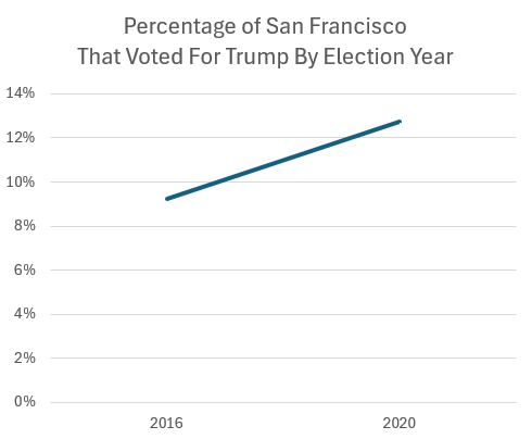
The graph presents a simple line chart illustrating a slight but steady increase in the percentage of San Francisco voters supporting Donald Trump between 2016 and 2020. The x-axis shows the election years (2016, 2020), and the y-axis depicts the percentage of votes, ranging from 0% to 14%. The line begins at approximately 9% in 2016 and rises to roughly 12.5% in 2020. It is a linear, upward trend. The graph is minimalist, lacking additional context or annotations.
Foucauldian Genealogical Discourse Analysis
From a Foucauldian perspective, this graph doesn't just show data; it embodies a specific discourse regarding political allegiance within San Francisco. The very framing of the question – "percentage who voted for Trump" – positions Trump's support as an anomaly needing explanation, particularly within a city that overwhelmingly opposes his politics.
- Power/Knowledge: The graph represents a certain kind of power/knowledge – the power to quantify and categorize political behavior, and the knowledge that (a) Trump gained some support even in a liberal bastion, and (b) that support increased over time. This knowledge isn’t neutral. It reinforces the narrative of a divided nation, or a slow 'drift' of political alignment.
- Genealogy: A genealogical analysis would trace the historical conditions that allowed for even a small percentage of Trump support in San Francisco. It wouldn't simply look at the 2016-2020 period but would investigate the pre-existing socio-economic grievances, racial tensions, anxieties about cultural change, or specific local political formations that might have contributed to this support. It would ask: What discourses preceded Trump that primed some San Franciscans to be receptive to his message? (e.g., the narratives around wealth inequality, "culture wars," or conservative backlash against progressive policies).
- Disciplinary Power: The act of quantifying this data creates a form of disciplinary power. It potentially singles out and categorizes those who voted for Trump, subjecting them to scrutiny and potentially normalizing judgments.
Critical Theory
This graph is ripe for a Critical Theory analysis, particularly focusing on concepts like hegemony and the culture industry.
- Hegemony: San Francisco is often considered a stronghold of progressive hegemony – a dominant ideological framework that shapes perceptions and norms. The graph's existence implies a concern about cracks in that hegemony. The increase, even small, is noteworthy because it challenges the expectation of unified opposition. It asks: What forces were working to undermine or contest the prevailing progressive norms?
- Culture Industry: The media landscape (the "culture industry") played a crucial role in shaping perceptions of Trump. This graph suggests that despite the overwhelmingly negative portrayal of Trump in mainstream San Francisco media, his message resonated with a growing (though still small) segment of the population. Why? Critical Theory would investigate how the culture industry (social media, alternative media, etc.) created spaces where Trump's narrative could gain traction.
- False Consciousness: From a critical perspective, one might argue that voters supporting Trump are experiencing a form of "false consciousness," unaware of the true implications of their choices for themselves and society. However, a nuanced approach would avoid simplistic accusations and instead explore the material conditions and ideological forces shaping their beliefs.
Marxist Conflict Theory
A Marxist analysis would focus on the socio-economic factors contributing to the shift.
- Class Conflict: San Francisco is a city marked by extreme economic inequality. While generally liberal, the tech boom has created a class of ultra-wealthy individuals who might have found common ground with Trump's pro-business rhetoric or tax policies. The graph could indicate growing dissatisfaction among these or other marginalized economic groups.
- Material Conditions: The increasing cost of living, housing crisis, and displacement in San Francisco create real material hardships. Even in a progressive city, these hardships can breed resentment and a desire for radical change, potentially leading some to support a figure like Trump who promised to disrupt the status quo (even if his solutions were misaligned with their interests).
- Ideology as Superstructure: The rise in Trump support could be seen as a manifestation of underlying class contradictions. Ideology (in this case, Trumpism) acts as a superstructure, reflecting and reinforcing the material conditions of economic inequality.
Postmodernism
A Postmodern lens would deconstruct the "truth" of the graph itself.
- Rejection of Grand Narratives: The graph attempts to create a cohesive narrative of political change. Postmodernism would question that narrative, pointing out the complexity and contingency of individual voting decisions. It would argue that there's no single, overarching explanation for the increase in Trump support.
- Deconstruction of Categories: The very categories used ("Trump voters," "San Francisco") are constructed and unstable. Who is a "Trump voter?" What is "San Francisco?" The graph relies on these categories without acknowledging their inherent ambiguity.
- Simulacra & Simulation: The image of Trump as presented in media (and thus influencing the votes) could be seen as a simulacrum – a copy without an original. The appeal might not be to Trump himself, but to the image of Trump.
Queer Feminist Intersectional Analysis
This is profoundly relevant in the context of San Francisco.
- Intersectionality: The graph doesn't reveal who these Trump voters are. A queer feminist intersectional analysis would highlight the crucial need to understand the interplay of multiple social categories (race, class, gender, sexuality, ability, etc.). Are the increasing Trump voters disproportionately from certain racial or ethnic groups? Are they concentrated in specific neighborhoods? Are they male or female? What are their specific experiences of marginalization or privilege?
- Backlash Against Progress: San Francisco is a hub of LGBTQ+ rights and feminist activism. The slight increase in Trump support could be interpreted as a backlash against these progressive gains, appealing to those who feel threatened by changing social norms or who hold traditional gender roles.
- White Supremacy and Patriarchy: Trump's rhetoric explicitly or implicitly appealed to white supremacist and patriarchal ideologies. An intersectional analysis would examine how these ideologies resonated within San Francisco, potentially finding support among those who feel disenfranchised or who benefit from existing power structures.
In conclusion, this seemingly simple graph is a complex artifact ripe for analysis through multiple theoretical frameworks. It's a window into the socio-political dynamics of San Francisco, revealing anxieties, contradictions, and challenges to the city's progressive identity. It's a reminder that even in the most liberal of cities, political fault lines exist and are subject to constant negotiation and change.
simple-description (llama3.2-vision_11b)
This meme is a graph showing the percentage of San Francisco voters who supported Donald Trump in the 2016 and 2020 presidential elections. The meme highlights the significant increase in Trump support in San Francisco, with the 2020 percentage more than doubling from 2016. The text "I'm not saying we're a Trump town, but..." is often added as a caption to this meme, implying that the city's voters have become more supportive of Trump's policies.
detailed-analysis (gemma3-27b-vision)
Okay, let's break down the provided line graph ("Percentage of San Francisco That Voted For Trump By Election Year") through the requested theoretical lenses. Since some lenses are more applicable than others, I'll focus where the theory offers significant insight.
1. Visual Description
The graph is a simple line chart depicting the percentage of San Francisco voters who supported Donald Trump in the 2016 and 2020 presidential elections. The y-axis ranges from 0% to 14%, and the x-axis shows the years 2016 and 2020. A solid, upward-sloping line connects the data points. The percentage of voters supporting Trump in 2016 is approximately 9%, and in 2020, it's approximately 13%. The overall impression is one of a modest increase in Trump support within San Francisco over these four years, despite the city being overwhelmingly Democratic.
2. Foucauldian Genealogical Discourse Analysis
This graph can be examined through a Foucauldian lens by considering the discourses surrounding political affiliation and the construction of "Trump support" as a category.
- Power/Knowledge: The very act of measuring this percentage reveals a desire to categorize and define those who support Trump. This categorization isn't neutral. It participates in a power dynamic that positions "Trump voters" as potentially "other," requiring observation and analysis. The graph itself is an artifact of this power/knowledge. It creates a subject (the "Trump voter") through its act of enumeration.
- Genealogy: Examining the history of how "Trump support" came to be understood within San Francisco would be crucial. What specific historical conditions (economic anxieties, cultural shifts, media narratives) contributed to the emergence of even this small percentage of support? The graph is a snapshot in this ongoing historical process.
- Disciplinary Power: While San Francisco is overwhelmingly progressive, the graph hints at the existence of disciplinary forces at play. Even a 9-13% showing signifies that those individuals exist within the city's social landscape. Analyzing how these individuals are "spoken of" or treated within the city’s dominant discourses could reveal how these forms of power work.
3. Critical Theory
This graph provides an opportunity to explore how societal structures and ideologies are maintained even in a seemingly progressive stronghold like San Francisco.
- Hegemony: The small but increasing percentage of Trump voters challenges the assumption of complete ideological dominance in San Francisco. It suggests that hegemonic forces, while strong, aren’t total. Even in a city known for its progressive values, alternative ideologies can gain traction. The graph indicates an ongoing struggle for ideological dominance.
- Domination & Resistance: The trend line could be interpreted as a form of "resistance" to the dominant progressive narrative within San Francisco. It's a minor form of resistance, but it signals the existence of counter-currents. Analyzing who these voters are (demographically, economically, culturally) could illuminate the sources of this resistance.
- Ideology: The graph can prompt questions about the appeal of Trump’s ideology to a segment of San Francisco voters. What specific anxieties or grievances are being addressed? This could require deeper qualitative research to understand the underlying ideological factors.
4. Marxist Conflict Theory
This graph can be interpreted through a Marxist lens by considering class relations and economic anxieties.
- Class Struggle: While San Francisco is known for its tech industry, it also has significant wealth inequality. Examining the demographics of Trump voters (income levels, employment sectors) could reveal if there’s a correlation between economic hardship and support for Trump. Were those who felt economically marginalized more likely to support Trump?
- False Consciousness: Could the support for Trump represent a form of "false consciousness" among some voters? Were they voting against their own material interests, perhaps based on cultural or symbolic appeals?
- Capitalism & Crisis: The graph could be seen as a symptom of broader economic anxieties related to capitalism. In times of economic uncertainty, individuals may be drawn to populist leaders who offer simplistic solutions. The trend line could reflect a growing sense of economic insecurity within San Francisco.
5. Queer Feminist Intersectional Analysis
While the graph itself doesn't immediately scream for this analysis, it can be relevant.
- Intersectional Vulnerability: Intersectional feminism highlights how individuals experience oppression based on multiple identities (race, class, gender, sexuality, etc.). A small but growing segment of Trump supporters in San Francisco might be more vulnerable in a city that historically champions inclusivity and social justice. Examining the overlap between these voters’ demographics and social vulnerabilities could reveal patterns.
- Backlash & Resistance: The increase in support for Trump, even slight, could be interpreted as a backlash against San Francisco's progressive social policies and LGBTQ+ inclusivity.
- Intersection of Power: Trump’s rhetoric often appeals to patriarchal and traditional values. How do these values intersect with the experiences of marginalized groups in San Francisco, and could this explain the small but growing support for him?
Postmodernism is least applicable in this situation. While postmodernism would acknowledge the instability of meaning and the constructed nature of categories, the graph itself is a relatively straightforward presentation of quantitative data. There’s no immediate need to deconstruct it in a postmodern way.
I hope this comprehensive analysis, organized by the requested theoretical lenses, provides a nuanced understanding of the graph. Let me know if you would like any of these sections expanded or explored in greater detail.
simple-description (llama3.2-vision)
The meme is a graph showing the percentage of San Francisco residents who voted for Donald Trump in the 2016 and 2020 presidential elections. The graph shows a significant increase in Trump's vote share in San Francisco from 2016 to 2020. The text "San Francisco: Where the lefties are really right" appears above the graph.