First Seen
2023-05-10T21:03:35+00:00
simple-description (llama3.2-vision_11b)
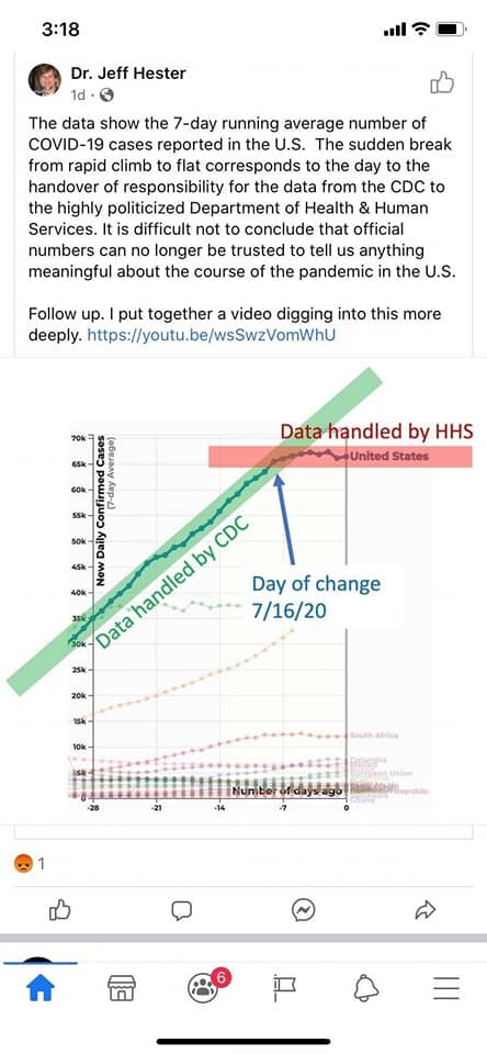
This meme is a screenshot of a Facebook post by Dr. Jeff Hester, a physicist and astronomer, who is known for his expertise on the topic of COVID-19. The post shows a graph of the 7-day average number of COVID-19 cases in the US, with a red line showing the number of cases in the US, and a green line showing the number of cases in other countries. The post is accompanied by a comment from Dr. Hester, who says "The data shows the 7-day average number of COVID-19 cases in the US. The sudden break from rapid climb to flat corresponds to the day to the handover of responsibility for the data from the CDC to the highly politicized Department of Health & Human Services. It is difficult not to conclude that official numbers can no longer be trusted to tell us anything meaningful about the course of the pandemic in the US."
detailed-analysis (gemma3-27b-vision)
Okay, here’s an analysis of the image and accompanying text, broken down into relevant theoretical frameworks. I'll indicate when a framework doesn't particularly apply, and I’ll prioritize the frameworks that do offer strong avenues for interpretation.
Please note: This is an interpretation based on the limited information presented in the image and caption. A more robust analysis would require deeper context and the full video linked in the caption.
1. Visual Description
The image is a screenshot of a social media post (likely Twitter/X) from “Dr. Jeff Hester.” It contains a graph depicting the 7-day running average of new confirmed COVID-19 cases in the United States.
- Graph: The graph shows a steep upward curve in cases, followed by a relatively abrupt leveling off and slight decline. A vertical line is drawn at “7/16/20,” marking what the poster identifies as a turning point.
- Annotations: The graph is labeled with "Data handled by CDC" for the period before the vertical line, and "Data handled by HHS" for the period after. There are arrows indicating the changing data management.
- Visual Style: The graph uses a color gradient, with the earlier data appearing darker and the later data lighter. The overall aesthetic is relatively clean and data-focused, although the annotations introduce a specific interpretative framing.
2. Foucauldian Genealogical Discourse Analysis
This is arguably the most relevant framework for interpreting this post. Michel Foucault’s work focused on how discourse – systems of thought, language, and practice – creates knowledge and power. A genealogical approach seeks to trace the historical emergence of these discourses, highlighting their contingency and their role in shaping what we consider “truth.”
- Power/Knowledge: The post directly addresses the relationship between power and knowledge. Dr. Hester suggests that the change in who manages the data (from CDC to HHS) coincides with a change in the presentation of cases. This implies that data is not neutral, but rather shaped by the institutions that collect and present it.
- Disciplinary Power: The shift in data handling could be seen as an exercise of disciplinary power. The HHS, as a governmental body, potentially reshaped the narrative around COVID-19 through its control over the data. The shift could be an attempt to manage public perception or align the data with a particular political agenda.
- Truth Regimes: The post challenges the idea of a singular, objective truth about the pandemic. By highlighting the change in data handling, it suggests that the official numbers may be less reliable than previously thought. This disrupts the “truth regime” that had been established by the CDC.
- Genealogy of the Numbers: A full genealogical analysis would trace the origins of the way COVID-19 cases were counted, the criteria used for testing, and the procedures for data collection. This would reveal the assumptions and biases embedded within the numbers themselves.
3. Critical Theory
Critical Theory, influenced by the Frankfurt School, is concerned with how power structures are maintained and reproduced through ideology and culture. It aligns with the Foucauldian analysis, but it brings a stronger focus on critique and emancipation.
- Ideology: The post suggests that official COVID-19 numbers may be serving an ideological function. The change in data management could be an attempt to downplay the severity of the pandemic or to promote a particular political narrative.
- Hegemony: The CDC previously held a degree of “hegemonic” authority in matters of public health. The shift to HHS could be seen as a challenge to this authority, and an attempt to establish a new dominant narrative.
- Critique of Enlightenment Reason: Critical Theorists are often skeptical of the idea of objective, value-free knowledge. The post echoes this skepticism by suggesting that data is not neutral but is always shaped by human interests and biases.
4. Marxist Conflict Theory
While applicable, this framework is less central than the Foucauldian and Critical Theory approaches. However, we can identify some potential lines of analysis.
- Class Struggle: While not explicitly stated, changes to data could have disproportionate impacts on different classes. For example, downplaying the severity of the pandemic could lead to fewer resources being allocated to communities most affected by the virus.
- Control of Information: The shift in data management could be seen as a form of control over information, used to maintain the power and privilege of certain groups. The HHS, as a government agency, may have different priorities than the CDC, and these priorities may be reflected in the way the data is presented.
5. Postmodernism
Postmodernism emphasizes the instability of meaning and the rejection of grand narratives. This framework is less direct than the others, but can be seen in the post's challenge to the authority of official data.
- Deconstruction of Truth: The post implicitly deconstructs the idea of a singular, objective truth about the pandemic. It suggests that data is always interpreted, and that different interpretations are possible.
- Rejection of Metanarratives: The post challenges the "metanarrative" of a straightforward, scientifically-driven response to the pandemic. It suggests that political and institutional factors play a significant role in shaping our understanding of the crisis.
6. Queer Feminist Intersectional Analysis
This framework is the least directly applicable, given the specific content of the post. However, we can consider how changes to data might affect marginalized groups.
- Disproportionate Impact: Changes to the way COVID-19 data is collected and presented could have disproportionate impacts on LGBTQ+ people, women, and people of color. For example, if data is not disaggregated by gender, race, or sexual orientation, it may be difficult to identify and address health disparities.
- Power and Control: The change in data management could be seen as another example of how power structures are used to control and marginalize certain groups.
In summary, the post lends itself most strongly to a Foucauldian and Critical Theory analysis. It raises important questions about the relationship between power, knowledge, and the construction of truth. While other frameworks can offer useful insights, they are less central to the core message of the post.
simple-description (llama3.2-vision)
This meme is a screenshot of a Facebook post by Dr. Jeff Hester, a scientist and astronomer. The post shows a graph of COVID-19 cases in the US, with a red line indicating the number of cases when the data was handed over to the CDC, and a green line indicating the number of cases when the data was handed over to the CDC after the Trump administration took control of the data. The text of the post reads: "The data shows the 7-day average number of COVID-19 cases in the US. The red line indicates the number of cases when the data was handed over to the CDC, and the green line indicates the number of cases when the data was handed over to the CDC after the Trump administration took control of the data."
tesseract-ocr
3:18 all> Dr. Jeff Hester Ors o The data show the 7-day running average number of COVID-19 cases reported in the U.S. The sudden break from rapid climb to flat corresponds to the day to the handover of responsibility for the data from the CDC to the highly politicized Department of Health & Human Services. Itis difficult not to conclude that official numbers can no longer be trusted to tell us anything meaningful about the course of the pandemic in the U.S. Follow up. | put together a video digging into this more deeply. https://youtu.be/wsSw2VomWhU oe b ndled by HHS we “i sou 2 SS = ; at = we Day of change KS 7/16/20 ie Hidbtitteresettisssasiadiscel amen B i a if 7 aaa : ei © 0 © a —— f @& FO =