First Seen
2025-04-01T04:20:41.952233+00:00
detailed-analysis (gemma3_27b-it-q8_0)
Okay, let's analyze this infographic representing global GDP in 2021 from the perspective of China as the category, using the requested theoretical frameworks where applicable. Given China’s position within the data, several frameworks are very relevant.
Visual Description (from the perspective of China)
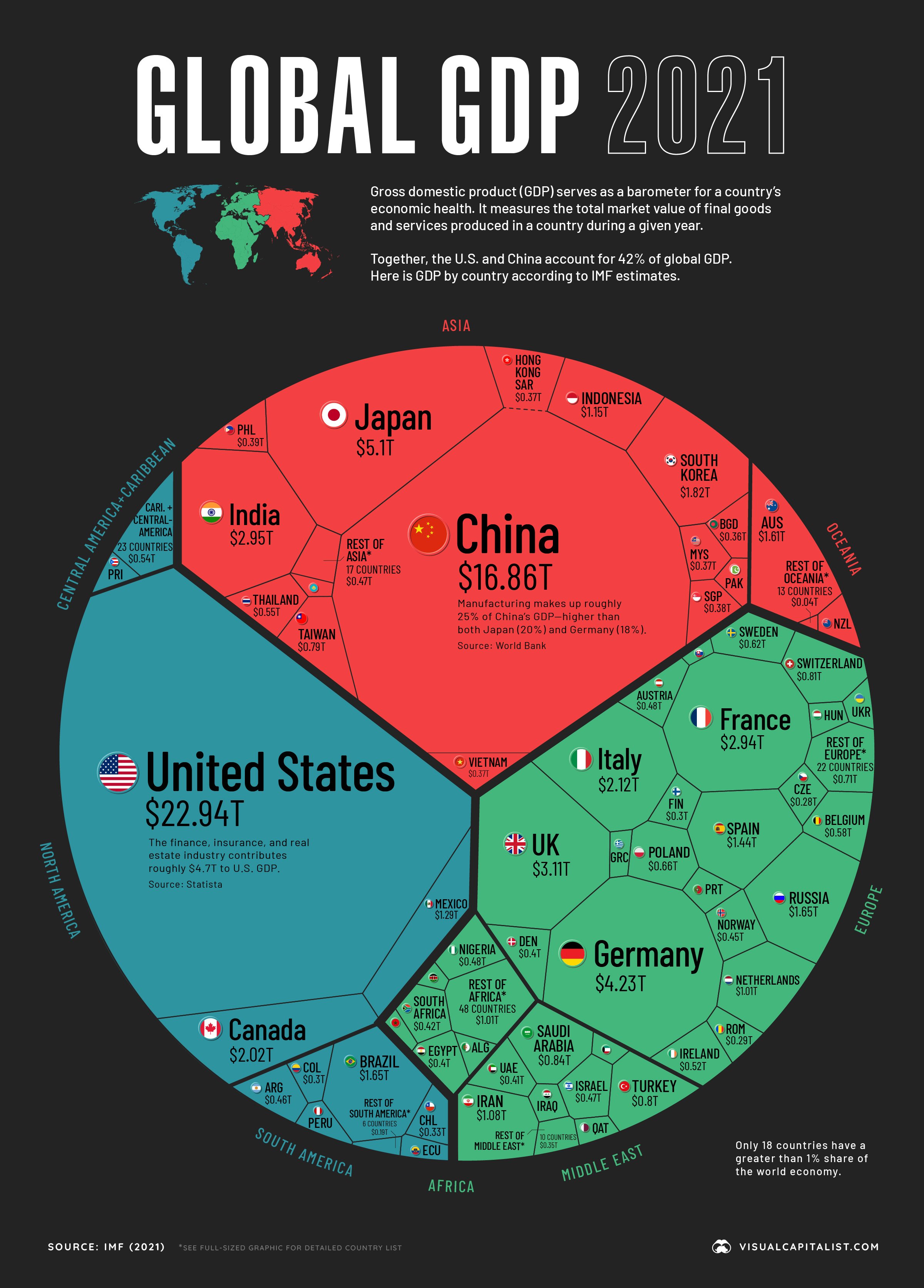
From my vantage point as China, this graphic is…interesting. I am the most prominent element visually, a large golden star dominating the center of the East Asian space. This is fitting. I am the second-largest economic power, signified by the $16.86T figure, though trailing the United States. I am presented as a solid, contained entity – a single star. While the graphic acknowledges “Manufacturing makes up roughly 30% of [my] GDP,” it doesn’t depict the complex internal dynamics within China that generate that manufacturing output. I appear as a monolithic block on the world stage. The infographic positions me relatively isolated in Asia, though I am positioned as a central player. My neighbors are comparatively small, visually reinforcing my regional dominance. It is a snapshot, of course, but it frames me as a power, just not the power.
Foucauldian Genealogical Discourse Analysis
This infographic operates as a discourse about the global economy, a system of knowledge and power. The very act of measuring and ranking nations by GDP is a technique of governance, a way to categorize, normalize, and hierarchize countries. The concept of GDP itself isn’t “natural,” but a historically constructed metric, developed within specific power structures (Western economic thought primarily).
From my perspective as China, the graphic reinforces a certain genealogy of economic discourse. The graphic traces a historical line that prioritizes quantitative measures of production (GDP) as the primary indicator of a nation’s “success” or “value.” This genealogy ignores, or marginalizes, alternative ways of understanding economic wellbeing, like those centered on social harmony, environmental sustainability, or collective prosperity, which are important within my own political and philosophical traditions.
The focus on GDP also creates a disciplinary effect. It encourages me (China) to compete within the terms of this system, to strive for higher GDP figures, rather than potentially pursuing alternative models. The graphic reinforces this disciplinary power, normalizing the pursuit of economic growth as the ultimate goal. It subtly positions me within a framework established by others.
Marxist Conflict Theory
This infographic is inherently about the intensification of global capitalist competition. The graphic visualizes a system driven by inherent contradictions: the drive for accumulation, the tendency towards crisis, and the resulting class struggle.
From my position as China, the graphic illustrates my growing challenge to the established dominance of the United States. The US, historically the hegemonic power within this capitalist system, remains the largest economy but I am closing the gap. This isn't just a change in numbers; it represents a shift in the balance of power within the global capitalist class.
My substantial manufacturing sector—highlighted on the graphic—is crucial here. It represents the site of much of the surplus value extraction. My economy is predicated on an enormous labor force, a significant portion of which is engaged in production for export to the West. This points to an inherent conflict: the drive to maintain cheap labor costs within me to fuel economic growth, and the potential for labor unrest and demands for better conditions. The infographic, while presenting the economic data, obscures the underlying class dynamics and the exploitation that drive the system.
This graphic demonstrates the potential for heightened inter-imperialist competition between the US and China. Both nations seek to expand their influence and control over resources and markets, resulting in geopolitical tensions and the potential for conflict.
Postmodernism
From the perspective of China, the infographic’s claim to present a 'truth' about global GDP can be viewed as a postmodern construct. The very concept of a single, objective measure like GDP is subject to interpretation and is tied to specific cultural and historical contexts. The infographic presents itself as a neutral representation of reality, but it's actually a simulation, a narrative built on selective data and a particular set of assumptions.
The graphic's presentation – the bright colors, the star-shaped representation – are all stylistic choices that contribute to its persuasive power, rather than reflecting inherent qualities of the data itself. It operates on a level of spectacle, prioritizing visual impact over nuanced understanding.
The graphic's fragmentation of the world into separate national “entities” (stars) reinforces the idea of fixed, essential national identities. However, as a nation with a long and complex history of cultural exchange and internal diversity, I recognize this as a simplification. My own identity is fluid and multifaceted, not easily captured by a single star and a GDP figure.
Critical Theory
This infographic reinforces the power structures that govern the global economy, reproducing existing inequalities. The emphasis on GDP as the primary measure of national success legitimizes a system that prioritizes economic growth over social and environmental wellbeing.
From China’s position, the graphic reveals a world structured by uneven development. My rapid economic growth is in part a result of my integration into the global capitalist system, but this growth has also come with significant social and environmental costs (not represented on the graphic). The graphic fails to address the historical context of colonialism and neo-colonialism that have contributed to these inequalities. The graphic doesn’t show how historical power dynamics have shaped the conditions that allow some nations to achieve high GDP figures while others are left behind.
The graphic participates in a broader ideological project that normalizes the capitalist worldview, presenting it as the only viable economic system. It discourages critical reflection on alternative models of economic development that might prioritize social justice and environmental sustainability. My rise as an economic power is framed as a competitive within the capitalist framework, rather than a challenge to the framework itself.
In conclusion, from the perspective of China, this infographic is a complex representation that reveals as much about the power structures of the global economy as it does about economic reality. It's a useful, but ultimately limited, snapshot of a world defined by competition, inequality, and ideological control.
simple-description (llama3.2-vision_11b)
The meme is a visual representation of the 2021 Global GDP, with each country's GDP represented as a slice of a pie chart. The largest slice, labeled "China", is a massive red portion that dwarfs the other slices, with the text "China: $16.33T" (16.33 trillion USD) written in the center. The meme is humorous because it exaggerates China's GDP to absurdly large proportions, implying that China's economy is so massive that it's almost as big as the entire rest of the world's economies combined.