First Seen
2025-04-01T04:20:59.222047+00:00
detailed-analysis (gemma3_27b-it-q8_0)
Okay, let's analyze this infographic, specifically from the perspective of "China" as the central subject, employing the requested theoretical frameworks where applicable.
Analysis of the G20 GDP Infographic: A Chinese Perspective
Visual Description
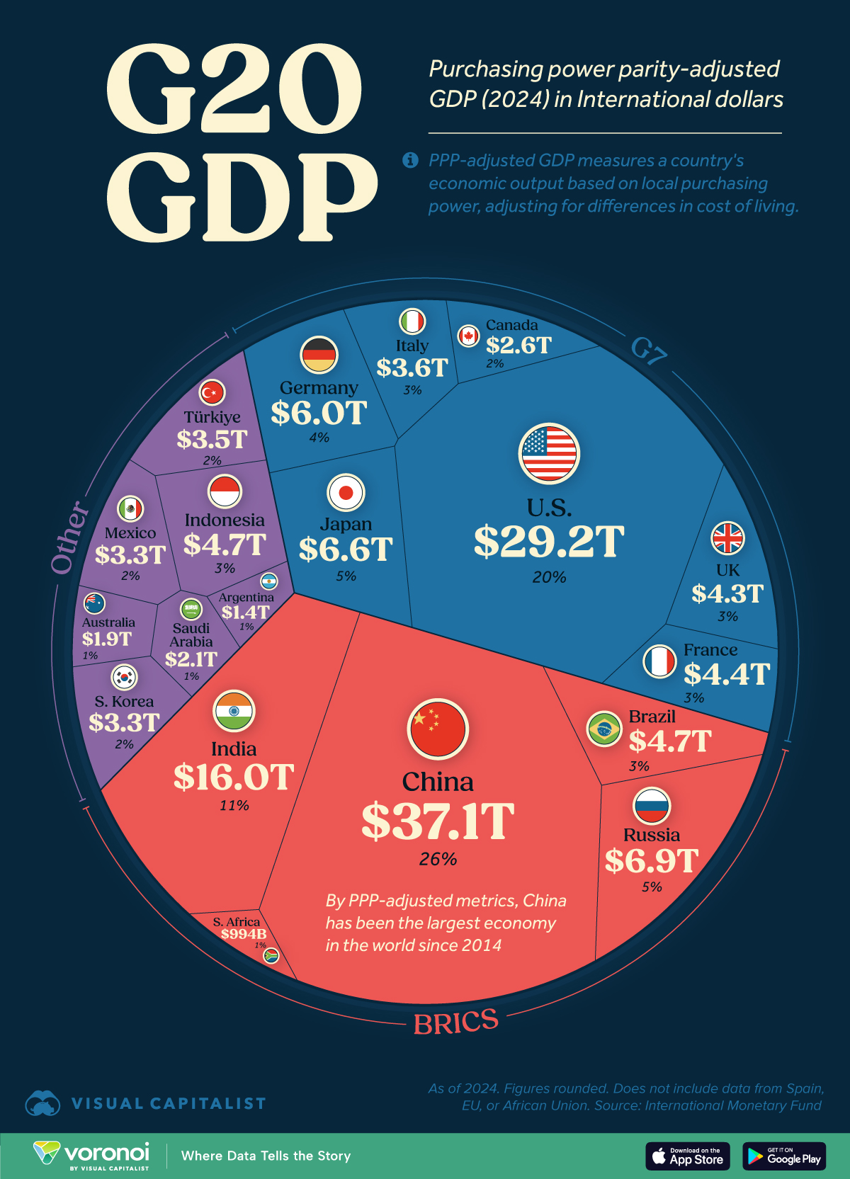
The infographic is a donut chart representing the Gross Domestic Product (GDP) of the G20 nations, adjusted for purchasing power parity (PPP). It’s visually dominated by two players: the United States (20% and colored in blue) and China (26%, colored red). The United States is on the right, and China on the bottom right. The red of China stands out due to its size and positioning. The infographic declares "China has been the largest economy by PPP-adjusted metrics since 2014." Other G20 members like Japan, Germany, India, and Russia are present, but significantly smaller in share. The infographic also highlights the BRICS nations (Brazil, Russia, India, China, and South Africa). The overall aesthetic emphasizes comparison and dominance, with a clean, modern, data-driven look. From a Chinese perspective, this visual reinforces a narrative of growing economic influence.
Foucauldian Genealogical Discourse Analysis
From a Chinese perspective, this infographic is a key element within a discourse on global economic power. Michel Foucault’s work allows us to trace how the concept of GDP, and the very categorization of nations by economic output, have emerged historically. It’s not a neutral calculation, but a product of Western (primarily American) institutions like the IMF and World Bank. The metric of GDP itself is a specific way of valuing activity, prioritizing quantifiable production and consumption, and arguably marginalizing other forms of value (e.g., social wellbeing, cultural preservation).
For China, this discourse presents a complex situation. Initially, accepting the GDP metric meant being evaluated by the standards of the West, potentially reinforcing a narrative of being "catching up." However, consistently being positioned as the largest economy by PPP (as the graphic proclaims) allows China to disrupt that narrative. China can reframe the discourse, suggesting that PPP is the more accurate and relevant measure, and thus, China is legitimately leading the global economy. The graphic, therefore, is not merely a representation of reality, but a site of struggle within a power/knowledge regime.
Critical Theory (Specifically Frankfurt School)
The infographic can be seen as an expression of the instrumental rationality critiqued by the Frankfurt School. The emphasis on GDP as the ultimate metric embodies the logic of domination, reducing human activity to quantifiable economic terms. From a Chinese viewpoint, there's an inherent tension here. China participates in this system, deploying the tools of economic growth to achieve national objectives. Yet, it’s a system arguably based on values that don't fully align with China's own historical or cultural priorities (e.g., the emphasis on individual consumerism versus collective wellbeing).
The dominance of the US and China (and the marginalization of other nations) is also relevant. The graphic could be interpreted as a visual representation of a bipolar world order. Critical theorists would question whether this order is truly beneficial for the global community, or simply reinforces a new form of exploitation and inequality – with China potentially joining the US as a dominant power, rather than challenging the fundamental structures.
Marxist Conflict Theory
From a Marxist perspective, the infographic demonstrates the inherent contradictions within global capitalism. The data shows the concentration of wealth and economic power in a few nations, particularly the US and China. This concentration signifies class struggle on a global scale, between the core capitalist nations (like US and China) and the periphery (the smaller, less developed economies).
China, as a nominally "socialist market economy," presents a fascinating case study. It has embraced capitalist methods of production to achieve phenomenal economic growth, but maintains a significant state role in the economy. From a Marxist viewpoint, this can be seen as a temporary deviation; eventually, the internal contradictions of capitalism will lead to a crisis within China itself, and potentially, exacerbate global inequalities.
The BRICS grouping is also significant. From this perspective, it represents a potential counter-hegemonic force, a coalition of nations seeking to challenge the dominance of the US and Western-led institutions. However, it’s crucial to remember that BRICS nations are not homogeneous; they have their own internal class struggles and conflicting interests.
Postmodernism
A postmodern reading would deconstruct the very notion of a “true” GDP, arguing that it's a social construct, a narrative imposed by those with power. The infographic itself is a simulacrum – a representation that has become detached from any underlying reality. The numbers are presented as objective truth, but they are, in fact, the result of complex methodologies, assumptions, and political choices.
From a Chinese perspective, postmodernism offers a way to challenge the Western-centric narratives about economic development. China can deploy its own counter-narratives, highlighting the limitations of Western metrics and promoting alternative models of economic growth, like the Belt and Road Initiative. It can embrace the ambiguity and fluidity of meaning, recognizing that "economic power" is not a fixed concept, but a shifting one.
Queer Feminist Intersectional Analysis
This framework is less directly applicable, but still offers valuable insight. While the infographic focuses on national economic power, it obscures the internal inequalities within those nations. The GDP growth doesn’t automatically translate to improved social conditions for all citizens.
A queer feminist intersectional perspective would highlight how these economic gains might be unevenly distributed along lines of gender, race, class, and sexuality. In China, for example, economic development has been accompanied by widening income inequality and challenges related to gender equality. It's important to ask who benefits from this economic growth, and who is marginalized. The infographic doesn’t tell that story. Furthermore, the focus on national GDP can reinforce nationalist narratives that can be used to justify discriminatory policies or suppress dissent.
In conclusion:
From a Chinese perspective, the infographic is a powerful, but inherently contested, visual representation of global economic power. It validates China’s growing influence, but also highlights the limitations of the dominant Western-centric metrics and the inherent contradictions of the global capitalist system. It can be deployed strategically to challenge existing power structures, promote alternative narratives, and advance China's own geopolitical interests. The analysis demonstrates that seemingly neutral data can be deeply political and should be interpreted through a variety of theoretical lenses.
simple-description (llama3.2-vision_11b)
The meme is a humorous representation of China's economic dominance, with a pie chart showing China's massive share of the global economy. The chart is divided into categories, with China's share being the largest, followed by the United States, but with a twist: the "China" slice is labeled as "China (1/2)" and the "US" slice is labeled as "US (1/2)" implying that China is half of the US. The text in the image reads "US (1/2)" and "China (1/2)" with a caption "China is half of the US" highlighting the absurdity of China's economic dominance.