First Seen
2025-05-08T17:37:19+00:00
detailed-analysis (gemma3_27b-it-q8_0)
Okay, let's analyze this image, which isn't inherently a meme but can be read as one in a specific astronomical context – specifically, as a playful commentary on the disproportionate attention given to certain celestial bodies versus others. We'll explore this through the lenses you've requested, only where relevant.
Visual Description
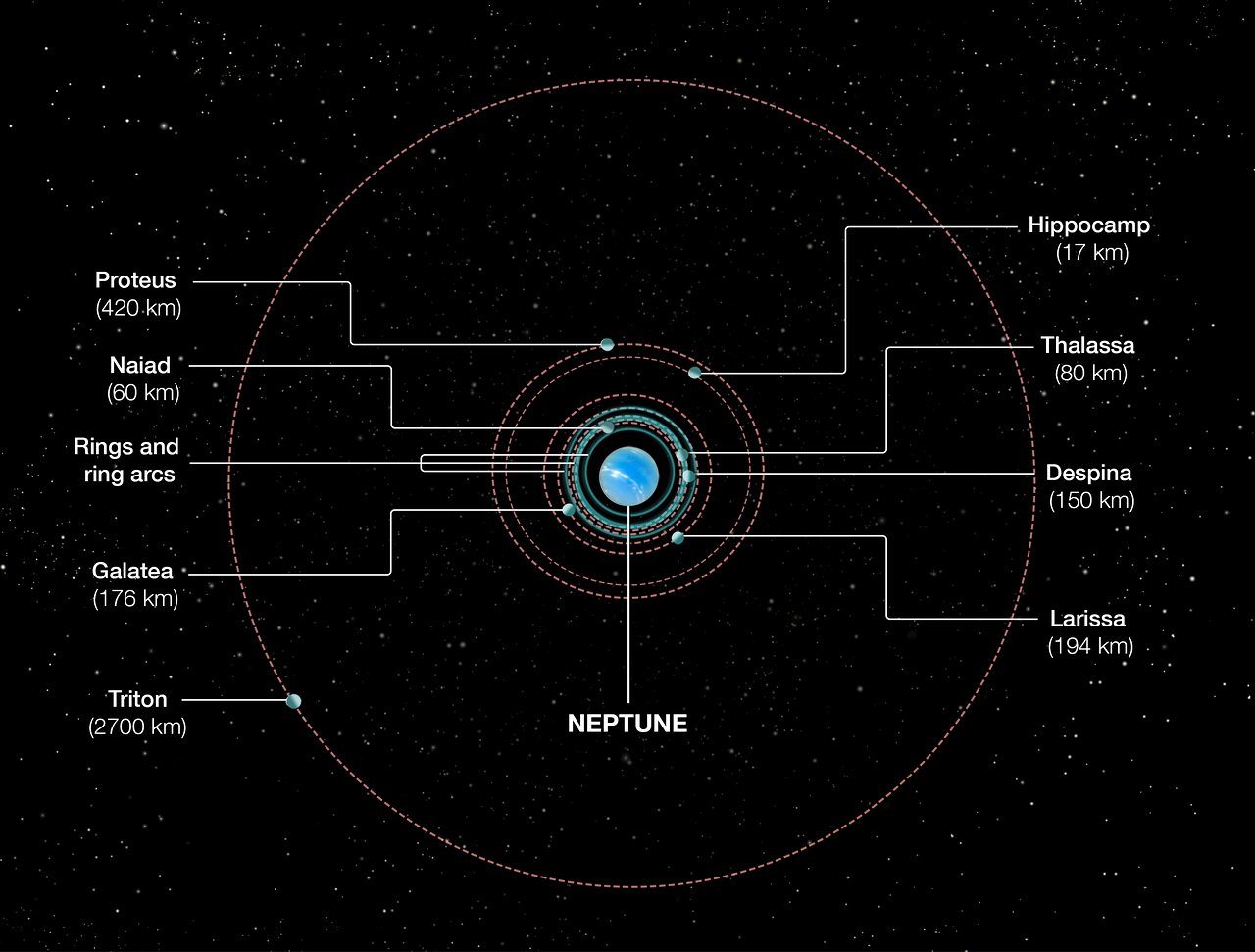
The image is a schematic diagram of Neptune and its primary moons and ring system. Neptune is at the center, depicted as a bright blue sphere. Radiating outwards are orbits of several moons: Triton (by far the largest, labeled with a 2700 km diameter), Proteus (420 km), Galatea (176 km), Larissa (194 km), Despina (150 km), Thalassa (80 km), Hippocamp (17 km), and Naiad (60 km). The rings and ring arcs are also indicated. Key to understanding this potential "meme" element is the scale. The image visually emphasizes the enormous size difference between Triton and the other moons; it’s utterly dominant. The lines connecting each moon to its label make it clear that the sizes are being directly compared. The background is a field of stars.
Foucauldian Genealogical Discourse Analysis
This image can be read through a Foucauldian lens as a visual representation of power dynamics in the construction of astronomical knowledge. Michel Foucault argued that knowledge isn’t neutral but is always produced within systems of power and discourse.
- The Historical Construction of 'Important' Bodies: Historically, larger celestial bodies have been prioritized for study. Triton, being by far the largest moon of Neptune, has been the subject of far more focused research (e.g., the Voyager 2 flyby, ongoing observations to understand its retrograde orbit and cryovolcanism). This has resulted in a richer, more detailed "discourse" about Triton.
- The Normalization of Scale: The visual representation here normalizes this scale difference. The very act of presenting it this way reinforces the idea that Triton deserves more attention. The naming conventions themselves, referencing figures from mythology (and the disproportionate allocation of myths to larger, “important” objects) contribute to this normalization.
- The Exclusion of Marginalized Data: The smaller moons, while fascinating in their own right, exist in the periphery of the dominant astronomical discourse. The image subtly highlights this marginalization. Their smaller sizes visually imply their lesser importance. This reinforces a hierarchy of knowledge.
Critical Theory
From a Critical Theory perspective, this image can be seen as reflecting a broader ideological tendency to prioritize grand narratives and large-scale phenomena over the details of the seemingly "insignificant."
- The Critique of Positivism: Classical astronomy often embodies a positivist approach – seeking "objective" truths about the universe. However, this image suggests that what counts as "truth" is shaped by the methods and priorities of the observer. The emphasis on size reflects a prioritization of easily quantifiable features.
- The Power of Representation: The way Neptune's moons are represented in this diagram impacts our understanding of them. It’s a visual argument for their relative importance. Critical theory challenges the idea that representations are neutral reflections of reality.
- Commodification of knowledge: The focus on “important” bodies like Triton can be seen to reflect a societal tendency to commodify knowledge, prioritizing things that generate higher returns (research funding, public interest, etc.).
Postmodernism
Postmodern thought would question the very idea of a definitive, objective diagram of Neptune’s system.
- Deconstruction of Hierarchy: Postmodernism dismantles hierarchies. The image’s visual hierarchy of size (Triton as dominant) can be “deconstructed” to show how this hierarchy is an artificial construct. Each moon is equally a moon of Neptune, regardless of size.
- The Subjectivity of Scale: The choice to emphasize size as the defining characteristic of importance is subjective. We could equally construct a diagram emphasizing orbital period, composition, or even the whimsicality of their names.
- The Simulacrum: The diagram itself becomes a simulacrum – a copy that precedes and defines the "real" Neptune system. It’s a constructed reality, a model that shapes our understanding.
In essence, the "meme" potential lies in the stark visual contrast. It can be interpreted as a playful jab at how we, as a scientific community and broader culture, tend to concentrate on the dramatic and large, potentially overlooking the rich diversity and subtle complexities within the seemingly "minor" components of the universe. It's a reminder that every celestial body, however small, has a story to tell.
simple-description (llama3.2-vision_11b)
This meme is a visual representation of the orbits of various celestial objects in our solar system, with Neptune at the center. The meme shows the orbits of 8 planets and 5 moons, with each object's orbit labeled and its distance from Neptune listed in kilometers. The meme is captioned "Neptune's orbit is so big it's hard to fit in a meme."