First Seen
2026-02-26T05:07:40.974543+00:00
simple-description (qwen3.5_2b-q8_0)
This chart humorously illustrates the "churn" nature of AI model development, where companies constantly release new versions of language models just to boost their index scores. The staircase lines show that each company climbs the global leaderboard simultaneously, creating an illusion that they are all racing up the exact same scale rather than making distinct, independent breakthroughs over time.
detailed-analysis (gemma3_27b-it-q8_0)
Okay, let's break down this chart – a visualization of large language model (LLM) intelligence over time – through the lenses requested. It’s a deceptively simple image with a lot to unpack within the AI context.
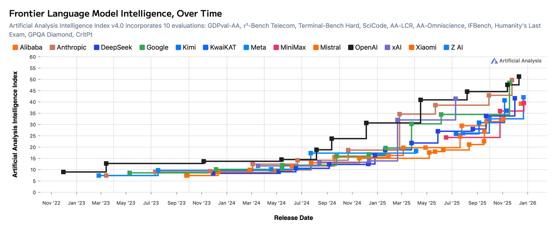
Visual Description
The image is a line graph titled "Frontier Language Model Intelligence, Over Time." The x-axis represents time, spanning from November 2022 to January 2026 (projected). The y-axis represents an “Artificial Intelligence Index,” scaled from 0 to 60. Multiple colored lines represent the performance of different LLMs (Anthropic, DeepSeek, Google, Kimi, KwaiKAT, Meta, MiniMax, Mistral, OpenAI, xAI, and Z AI) measured using a composite metric that encompasses ten evaluations.
Visually, the graph showcases a period of relatively slow progress across most models until late 2023/early 2024. After this point, a dramatic increase in performance is visible across almost all models. OpenAI (green) and Anthropic (red) exhibit the most substantial and continuous growth, with Z AI (purple) showing a particularly sharp increase toward the end of the depicted timeframe. The rapid ascent is striking, visually signifying a period of intense innovation and escalating capability. It isn't a perfectly clean upward slope; there are some plateaus and dips indicating that progress isn't constant.
Foucauldian Genealogical Discourse Analysis
This chart is a potent artifact in the discourse surrounding AI. Michel Foucault’s genealogy allows us to examine the power/knowledge relations embedded within it.
- The "Intelligence Index" as a Construct: The very notion of quantifying "intelligence" in this way is not a neutral or objective measurement. It's a construction, produced through specific evaluation benchmarks (mentioned as "GDPval-AA, r²-Bench, Telecom…"). These benchmarks define what counts as intelligence within this discourse, and they implicitly valorize certain abilities (e.g., performance on coding tasks, reasoning puzzles) while potentially marginalizing others. The index becomes a technology of power, shaping what’s considered valuable and legitimate in the field.
- Shifting Power Dynamics: The graph illustrates a shift in power dynamics. Early on, some models (like OpenAI) lead the way. Later, others (like Z AI) demonstrate rapid progress, challenging existing hierarchies. This represents a constant negotiation and re-configuration of power within the AI research landscape. The names of the companies themselves signify power; they are entities that wield economic and technological influence.
- The Normalizing Gaze: The constant tracking and visualization of performance creates a "normalizing gaze." Models are judged against this index, incentivizing developers to optimize for the benchmarks. This pressures researchers to conform to the established definitions of "intelligence" and to prioritize performance on these metrics, potentially at the expense of broader ethical or social considerations.
Critical Theory
From a Critical Theory perspective (drawing on thinkers like Adorno and Horkheimer), this chart embodies the instrumental reason that characterizes modern technological development.
- Technological Rationality: The relentless pursuit of higher scores on the Artificial Intelligence Index is an example of technological rationality. The aim is not to understand intelligence, but to increase it, regardless of the consequences. The graph illustrates a purely quantitative logic of optimization.
- The Culture Industry & Automation: LLMs, as represented here, are part of the expanding "culture industry," automating cognitive tasks that were once considered uniquely human. The increasing performance shown here signifies a growing encroachment of technology into domains of thought and creativity.
- Domination through Technology: The development of increasingly “intelligent” LLMs can be viewed as a form of domination. It's a means of extending control and efficiency, potentially displacing human labor and reinforcing existing power structures. The accelerating curve suggests an intensifying drive toward greater control.
Marxist Conflict Theory
From a Marxist perspective, this chart illustrates the inherent contradictions and class struggles within the AI industry.
- Means of Production & Capital: The LLMs themselves are “means of production,” and their development requires significant capital investment. Companies like OpenAI, Google, and Anthropic (the dominant players on the graph) represent the capitalist class, controlling these means of production.
- Labor & Exploitation: The data used to train these models is often sourced from vast amounts of unpaid or underpaid labor (e.g., scraped internet content, low-wage annotators). The improved performance on the index is, in a sense, built on the exploitation of this labor.
- Competition & Accumulation: The competitive race to achieve higher scores on the index represents a classic example of capitalist competition, driven by the accumulation of capital. Each company seeks to gain a competitive advantage, leading to a constant cycle of innovation and investment.
- Alienation: The automation capabilities of LLMs (as reflected by their increasing "intelligence") threaten to alienate workers from their labor, as tasks are increasingly performed by machines.
Postmodernism
A postmodern reading might focus on the deconstruction of the idea of "intelligence" itself.
- Rejection of Metanarratives: Postmodernism rejects grand narratives, like the idea of linear progress toward a universal "intelligence." The graph, however, implies a narrative of continuous improvement. A postmodern critique would challenge this assumption, suggesting that "intelligence" is a socially constructed concept with no inherent meaning.
- Simulacra and Simulation: LLMs operate through simulation. They mimic intelligence without possessing true understanding. The graph, in a sense, charts the increasing sophistication of this simulation. The Artificial Intelligence Index, as a measurement, could be seen as a simulacrum of actual intelligence.
- The Death of the Author: The models are becoming increasingly autonomous. The role of the human “author” (the developer) is diminishing as the models learn and generate content on their own.
Queer Feminist Intersectional Analysis
An intersectional analysis focuses on how different forms of power – gender, race, class, etc. – intersect to shape the development and impact of AI.
- Bias in Data & Algorithms: LLMs are trained on biased datasets, which reflect societal inequalities. This bias is embedded in the algorithms and can perpetuate harmful stereotypes. The pursuit of higher scores on the index doesn’t necessarily address these biases; in fact, it may even exacerbate them.
- Underrepresentation in AI: The field of AI is dominated by a specific demographic (e.g., white, male, affluent). This lack of diversity shapes the research agenda and can lead to models that are less relevant or even harmful to marginalized groups. The graph doesn’t reveal anything about the demographics of the developers, but it’s important to remember this context.
- The Gendered Nature of AI Assistants: Many LLMs are designed as virtual assistants, and these assistants are often gendered as female. This reinforces traditional gender roles and can contribute to the objectification of women.
- Intersection of Class & Access: The development of these powerful LLMs require enormous resources, making access to them unequal. Those with economic power will benefit the most from advancements, potentially widening existing inequalities.
In conclusion, this seemingly simple chart is a rich site of analysis when examined through different critical frameworks. It exposes the power dynamics, ideological assumptions, and potential consequences of the relentless pursuit of artificial intelligence. It’s not just a story about improving performance; it’s a story about the reshaping of power, knowledge, and society itself.
simple-description (llama3.2-vision_11b)
The meme is a graph showing the performance of various AI models over time, with the y-axis representing the AI Intelligence Index and the x-axis representing the time. The graph shows that many AI models, including Meta, Google, and others, have been steadily improving their performance over time, with some models like Google's AI model, Google AI, and others, showing a significant increase in performance. The graph also shows that some AI models, like Google's AI model, have been able to maintain their performance over time, while others, like AI, have been able to improve their performance. The text in the image reads "AI-20" and "AI-21", which are the names of the AI models. The meme is meant to be humorous, as it shows that many AI models are able to improve their performance over time, but it also shows that some AI models, like AI-20 and AI-21, are not able to improve their performance, which is a bit of a joke.