First Seen
2026-03-20T21:32:09.235111+00:00
simple-description (qwen3.5_2b-q8_0)
Although you cannot view this chart directly, it depicts gas prices hovering around $3 per gallon for years until suddenly skyrocketing in March 2026. In an anti-Trump context, this illustrates the irony of economic conditions remaining low and stagnant for a long time (like Biden's approach) before suddenly "taking back control" with massive price spikes once again.
detailed-analysis (gemma3_27b-it-q8_0)
Okay, let's analyze this gas price chart from an "Anti-Trump" category perspective, delving into the requested theoretical frameworks where applicable.
Visual Description
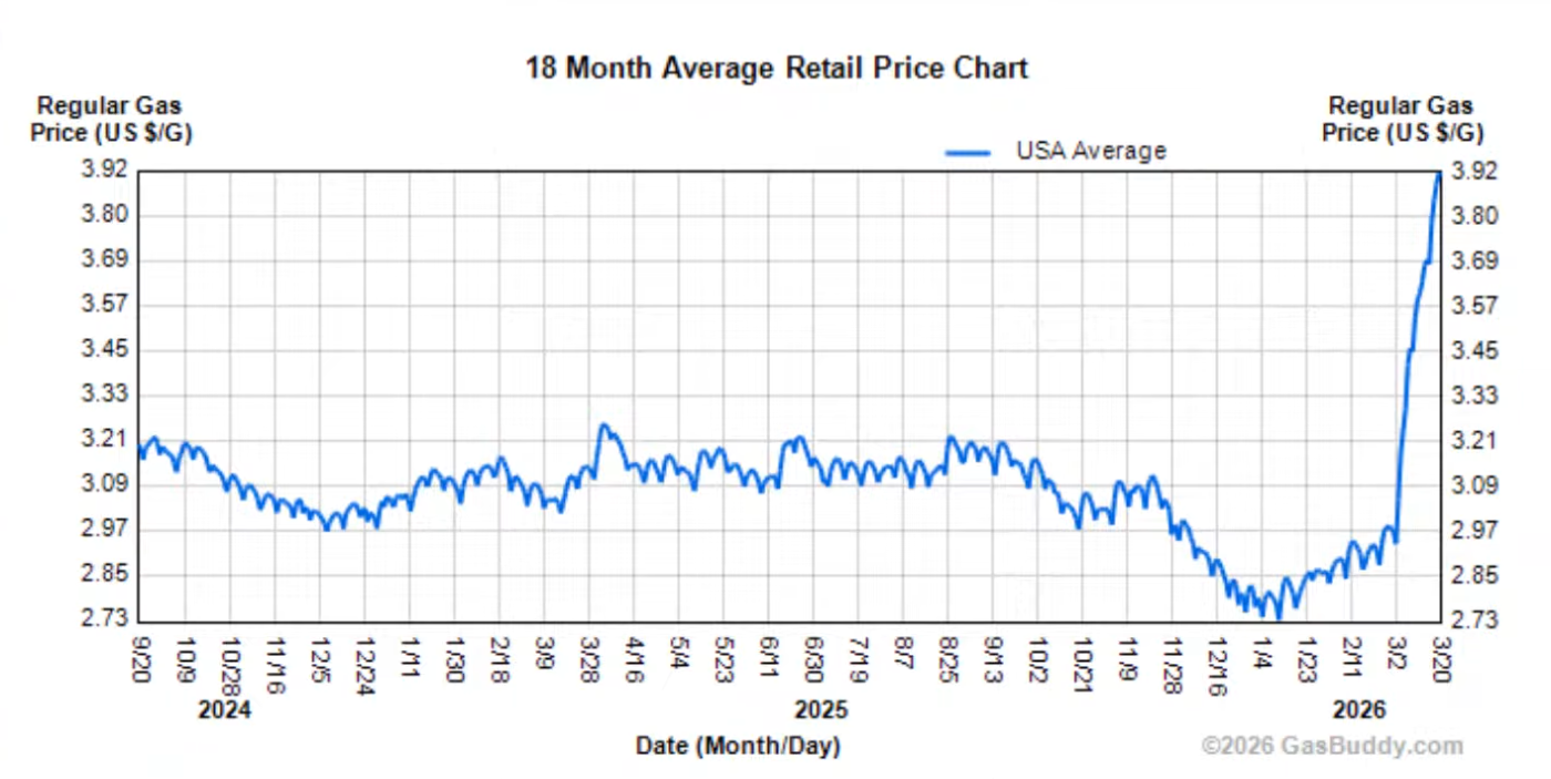
The image presents a line graph tracking the average US retail price of regular gasoline from September 2024 through March 2026. The y-axis ranges from $2.73 to $3.92 per gallon. The x-axis denotes time in monthly increments. The line oscillates, initially decreasing from September 2024 to November 2024, stabilizing for a period, then declining sharply from late 2025 into early 2026 before climbing drastically in March 2026. The chart’s data source is credited to GasBuddy.com. From the anti-Trump perspective, the most salient feature is the rapid increase in gas prices towards the end of the chart, in March 2026. This is the point likely being signaled as problematic.
Foucauldian Genealogical Discourse Analysis
From an Anti-Trump stance, this chart can be interpreted through a Foucauldian lens examining the discourses around energy, economy, and national identity constructed during the Trump era and its immediate aftermath. The sharp price increase is not merely an economic phenomenon, but a result of specific power/knowledge regimes.
- Historical Construction of "Energy Independence": Trump’s rhetoric heavily emphasized “energy independence” often conflated with oil production. The genealogy of this idea reveals it wasn't neutral but tied to deregulation, fossil fuel industry support, and a particular vision of American strength. The post-Trump rise in prices can be seen as a breakdown of this manufactured narrative; a return to realities ignored or obscured by the previous administration's discourse.
- Discipline and Punish (Economic Anxiety): The fluctuating prices, and the final rise, become a disciplinary mechanism. They contribute to economic anxiety among the populace, anxieties that were exploited by Trump's populist appeal. The Anti-Trump viewpoint asserts that the instability and then sharp increase are a punishment for policies that prioritized short-term gains (deregulation, tax cuts for the wealthy) over long-term sustainable energy solutions.
- The Discourse of Blame: A key aspect of the Anti-Trump narrative is to deflect blame away from legitimate market forces or global events (if they apply) and instead attribute the price increase to the lingering effects of Trump’s policies, or to portray his supporters as complicit in creating these conditions. The chart becomes evidence in a larger discursive battle over causality.
Critical Theory
Applying Critical Theory, particularly the Frankfurt School’s emphasis on the "culture industry," we can see the chart as part of a larger system of ideological reproduction.
- Instrumental Reason: The pursuit of profit by oil companies and the political decisions supporting them, framed as "rational" economic policy by Trump’s administration, are examples of “instrumental reason” gone awry. This reason prioritizes efficiency and maximizing profit above all else, leading to unsustainable and potentially damaging consequences like volatile energy markets.
- False Consciousness: Trump's messaging around energy and the economy fostered a “false consciousness” among his supporters, obscuring the structural factors contributing to economic inequality and environmental degradation. The chart can be used to reveal this false consciousness. The Anti-Trump argument is that his supporters were misled into believing policies that benefited a small elite were in their own best interests.
- Commodification: The chart reflects the commodification of a basic necessity (energy). The price fluctuations are presented as objective market forces, but the Anti-Trump perspective argues this obscures the power dynamics and deliberate manipulation that influence the market.
Marxist Conflict Theory
From a Marxist perspective, the chart is a visual representation of class struggle and the inherent contradictions of capitalism.
- Capital vs. Labor: The rise in gas prices directly impacts the working class, reducing their disposable income and exacerbating economic hardship. Oil companies (representing capital) profit from these increases, widening the gap between the owners of capital and those who sell their labor.
- Exploitation: Trump's policies are framed as favoring the capitalist class (oil industry) at the expense of the working class. Deregulation and tax cuts for oil companies are seen as enabling exploitation of resources and workers.
- Contradictions of Capitalism: The graph illustrates the inherent instability and cyclical crises of capitalism. The boom-and-bust cycle of energy prices is not accidental but a structural feature of the system. The Anti-Trump narrative often frames Trump's policies as accelerating these contradictions.
Postmodernism
A postmodern reading focuses on the breakdown of grand narratives and the constructed nature of reality.
- Deconstruction of "Energy Independence": The chart deconstructs the Trumpian narrative of "energy independence" by revealing its fragility and dependence on global factors. The narrative was not grounded in objective truth, but was a constructed ideology used to legitimize certain policies.
- Simulacra and Simulation: The idea of "energy independence" itself can be seen as a simulacrum—a copy without an original. It was an image created to obscure a more complex reality. The chart exposes the artificiality of this image.
- Relativism and Interpretation: The chart can be interpreted in multiple ways, but the Anti-Trump perspective emphasizes one particular interpretation – that it is evidence of the failure of Trump’s energy policies. Postmodernism doesn’t negate the possibility of a politically motivated interpretation, but acknowledges it as one possible reading.
In summary: From an Anti-Trump perspective, this gas price chart is a potent symbol of the failures and negative consequences of his policies. It's used to bolster arguments about economic inequality, environmental irresponsibility, and the manipulation of public perception. The chart’s significance is amplified through critical lenses that reveal the power dynamics, ideological constructions, and systemic contradictions at play.
simple-description (llama3.2-vision_11b)
The meme is a graph showing the average price of gas in the US from 2024 to 2026. The graph shows a steady increase in gas prices over the next two years, with a significant spike in 2026. The text "18 Month Average Retail Price Chart" appears at the top of the graph, and the graph is labeled "USA Average" and "Regular Gas Price (US $/G)". The graph is presented by GasBuddy.com, a website that tracks gas prices. The meme suggests that gas prices will continue to rise in the next two years, making it more expensive for people to fill up their cars. The graph is likely intended to be used as a visual aid to help people understand the trend of rising gas prices and how it may impact their daily lives. Overall, the meme is a commentary on the increasing cost of living and the impact of rising gas prices on the average American.