First Seen
2025-04-12T05:56:08.407052+00:00
detailed-analysis (gemma3_27b-it-q8_0)
Okay, let's break down this YouGov data visualization from an "Anti-Trump" perspective, drawing on relevant critical theories where applicable. I will organize this as requested, only including sections when the theory offers useful insight. Because the prompt specifies this is a "meme" (though it's data visualization), I’ll interpret it as a readily shareable, politically charged image meant to convey a certain argument.
Visual Description
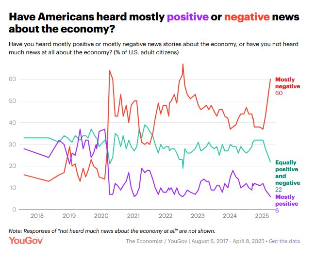
The image is a line graph depicting the percentage of U.S. adults who report hearing “mostly negative” vs. “mostly positive” or “equally positive and negative” news about the economy between 2018 and 2025 (projected). Three lines are represented:
- Red: “Mostly Negative” news – this line dominates, generally hovering above 40% and peaking dramatically around late 2020/early 2021 and again in 2022. It remains significantly higher than the other lines throughout most of the period.
- Purple: “Equally Positive and Negative” news – a mid-range line, generally between 10% and 30%, with less dramatic fluctuations.
- Teal: “Mostly Positive” news – a consistently low line, usually below 20%, with brief spikes, but significantly lower than the other two lines.
The graph's timeframe clearly aligns with the Trump presidency (2017-2021) and the immediate aftermath. The data source is indicated as YouGov/The Economist.
Foucauldian Genealogical Discourse Analysis
From an Anti-Trump perspective, this graph isn't just about "news," it's about the production of truth regarding the economy. A Foucauldian analysis would look at how narratives about the economy – and specifically, negative narratives – became dominant during and after the Trump era.
- Power/Knowledge: The Trump administration actively constructed a discourse of economic success, claiming a booming economy despite indicators that were more complex. This graph suggests the public largely didn’t buy it. The overwhelming prevalence of "mostly negative" perception points to a counter-discourse taking hold – a resistance to the administration’s claims. This demonstrates how 'truth' is not objective, but constructed through power relations.
- Discursive Shifts: The spikes in negative sentiment correlate with major events – the onset of the COVID-19 pandemic, and subsequent economic disruptions, combined with the Trump administration's response. This shows how crises provide opportunities for challenging dominant discourses. The shift is not just about economic reality, but about the framing of that reality. The media, political opposition, and even everyday citizens participated in this counter-discourse.
- Genealogy of “Economic Anxiety”: The prolonged negativity, even after Trump left office, suggests a genealogy of economic anxiety that predates but was exacerbated by his policies and rhetoric. The promise of economic revival (the “Make America Great Again” slogan) wasn’t fulfilled for many, leading to sustained skepticism.
Critical Theory
This visualization can be interpreted through the lens of Critical Theory, which examines how social structures maintain power imbalances.
- Ideology Critique: The data suggests a failure of dominant ideology. The dominant ideology (in this case, the narrative of Trump’s economic success) did not effectively penetrate public consciousness. The prevalence of negative views indicates a rejection of this ideology.
- The Culture Industry: The media (as reflected in the data on reported news consumption) played a critical role in shaping these perceptions. From an anti-Trump perspective, the media (at least segments of it) acted as a critical force, exposing the weaknesses of the economic narrative being promoted. The rise of negative reporting isn’t simply reflection of economic hardship, but active production of critical consciousness.
- False Consciousness: The “Mostly Positive” line is so consistently low, it can be seen as indicating a breakdown of false consciousness – the idea that people are unaware of the true nature of their exploitation or the systemic issues affecting their lives. People were aware of economic precarity.
Marxist Conflict Theory
From a Marxist perspective, this graph reflects the underlying class conflicts inherent in capitalism.
- Contradictions of Capitalism: The economic realities of the Trump years – growing inequality, stagnant wages for many, and the fragility of supply chains – likely fueled the negative perceptions. These are inherent contradictions of the capitalist system.
- Class Consciousness: While the data doesn't directly measure class, it’s plausible that those most affected by economic hardship (the working class) were more likely to report hearing “mostly negative” news. This could represent a growing class consciousness.
- Ideological Struggle: The Trump administration's economic narrative was an attempt to obscure these contradictions and maintain the legitimacy of the capitalist system. The graph suggests that this attempt was largely unsuccessful. It shows a struggle between the ruling class's ideology and the reality experienced by the majority.
In conclusion, from an Anti-Trump perspective, this graph isn’t just a neutral depiction of public opinion. It's evidence of a rejection of a flawed economic narrative, a triumph of critical consciousness, and a reflection of the deeper structural inequalities that define the current economic system. It’s a “meme” that reinforces the idea that Trump’s economic promises were false and that his presidency left a legacy of economic anxiety and skepticism.
simple-description (llama3.2-vision_11b)
The meme is a graph showing the percentage of Americans who believe the economy is getting worse, with a sharp spike in 2020. The text above the graph reads "Most Americans think the economy is getting worse." The meme is likely being used to express a sense of pessimism or frustration with the current state of the economy.