First Seen
2026-03-09T16:48:53.144570+00:00
simple-description (qwen3.5_2b-q8_0)
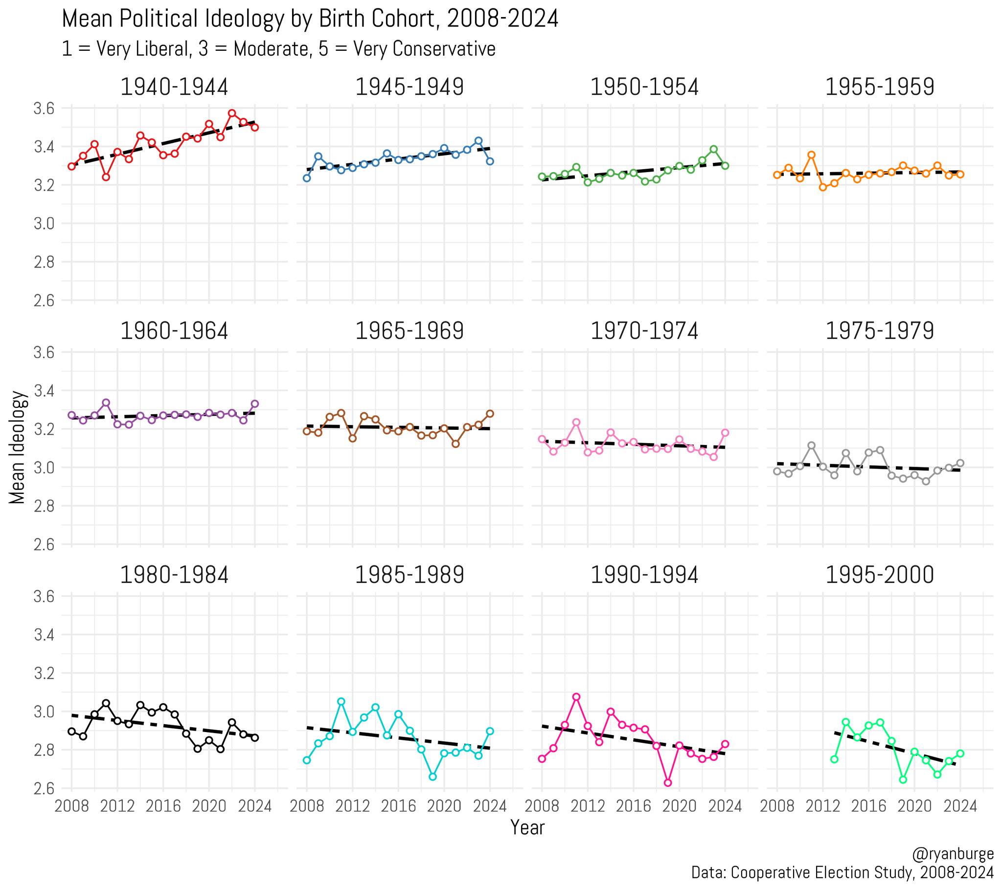
This meme plays on the political concept of being "anti-reactionary"—someone who refuses to change their views based on current news or social norms. The chart illustrates that for generations born between 1940 and 1980, people have not fundamentally shifted their political views; they have simply remained in the same ideological bubbles over time (2008-2024). As evidenced by the nearly static red line for the 1940s cohort and the flat trends across others, these individuals appear to be following historical trajectories rather than reacting to present-day events.
detailed-analysis (gemma3_27b-it-q8_0)
Okay, let's break down this meme from an "Anti-Reactionary" perspective, utilizing the frameworks you requested where relevant. An "Anti-Reactionary" position fundamentally rejects attempts to return to a perceived golden age or previous social order, viewing progress (however defined) as crucial and often identifying reactionary movements as inherently oppressive. This lens will heavily influence our interpretation.
Important Note: This analysis operates under the assumption of a fairly sophisticated Anti-Reactionary perspective that incorporates elements from multiple theoretical strands. It's also a complex dataset; a full, perfectly nuanced interpretation would be very long, so this will aim for a strong, well-supported overview.
Visual Description
The meme presents a series of line graphs, each representing the average self-reported political ideology (on a scale of 1-5, with 3 being moderate) of individuals born within a specific cohort (e.g., 1940-1944, 1945-1949, etc.). The x-axis represents time (2008-2024). The graphs depict trends in these average ideologies over the 16-year period. The key feature is the divergence between cohorts. Some show relatively stable moderate positions, while others display significant shifts, frequently trending towards increasing polarization (often leaning slightly left, but occasionally right). The color coding is consistent across graphs, making comparison easier.
Foucauldian Genealogical Discourse Analysis
From an Anti-Reactionary, Foucauldian viewpoint, this data is incredibly rich. It represents a mapping of shifts in discourses around political identity. It's not simply about "changing opinions," but about how the very ways people understand and articulate their political positions have evolved.
- Power/Knowledge: The data demonstrates how power operates through shaping the available discourses. The fluctuations aren’t random. They are products of historical events (e.g., the 2008 financial crisis, the rise of social media, the Trump presidency, the COVID-19 pandemic, etc.) that reshape how people perceive the social world. The fact that some cohorts exhibit more significant shifts indicates that certain groups were more susceptible to these discursive shifts, and perhaps had less access to counter-narratives.
- Genealogy of the "Political Spectrum": The very idea of a 1-5 scale is a historically contingent construct. Foucault would urge us to ask where this scale came from, who created it, and what purposes it serves. An Anti-Reactionary would see the initial framing of the spectrum as likely already biased toward certain viewpoints (potentially liberal/moderate). The data then shows how that framing has been contested and reshaped. The variations across cohorts suggest an eroding consensus around the meaning of "moderate" or "left/right," which is itself a point of interest.
- Normalization and Discipline: The fact that any cohorts adhere to this scale, and that their ideologies can be measured this way, suggests a degree of disciplinary power at work. Individuals are being "normalized" into categories and expected to identify within them. The Anti-Reactionary would note that this normalization can be used to exclude or marginalize those who don’t fit neatly into these pre-defined boxes.
Critical Theory
Critical Theory emphasizes the role of ideology in maintaining power structures. This meme illustrates several key points from that perspective:
- False Consciousness: The fact that many cohorts hover around the "moderate" position (3) could be interpreted, critically, as a form of false consciousness. Individuals might believe they are thinking independently, but their ideologies are shaped by dominant cultural narratives that serve the interests of the ruling class (or other dominant groups).
- Hegemony: The fluctuations across cohorts suggest a struggle for hegemony – a battle over which ideologies become dominant. The shifting lines indicate that this hegemony is not stable, but is constantly being challenged and renegotiated. The leftward shift in some cohorts could represent a growing awareness of systemic inequalities.
- Commodification of Politics: Critical Theorists might point out that the very act of quantifying ideology, and presenting it in a digestible graph, is a form of commodification of politics. It reduces complex social and political issues to data points, making them easier to consume but also potentially stripping them of their nuance and urgency.
Marxist Conflict Theory
From a Marxist lens, the data reflects underlying class tensions.
- Class-Based Polarization: The divergence between cohorts could be linked to differing experiences of economic and social change based on class. For instance, younger cohorts (1980s-1990s born) who came of age during periods of increasing economic inequality and precarity might be more likely to develop progressive or radical ideologies. The cohorts born during times of relative economic stability (e.g., the post-war boom) might be more likely to maintain moderate positions.
- Ideology as Superstructure: The ideologies represented in the graphs are seen as part of the superstructure, reflecting the material conditions of society. Changes in the economic base (e.g., deindustrialization, globalization) inevitably lead to changes in the ideological sphere.
- Class Consciousness: The leftward shifts in some cohorts could be interpreted as a growing class consciousness – an awareness of one’s position within the class structure and of the inherent conflicts between classes.
Postmodernism
Postmodern thought challenges grand narratives and emphasizes the instability of meaning.
- Deconstruction of "Ideology": A postmodernist would deconstruct the very concept of "ideology" as a fixed and coherent system of beliefs. They would argue that ideologies are fluid, fragmented, and often contradictory. The variations in the graphs support this idea; there's no single, unified ideological trajectory.
- Relativism & Subjectivity: The data underscores the subjectivity of political belief. There is no objective "right" or "wrong" ideology. Meaning is constructed through individual experience and social interaction. The Anti-Reactionary leans into this to deny the legitimacy of claims of “timeless truths” or “natural orders” frequently invoked by reactionary movements.
- Simulation and Hyperreality: The meme itself could be seen as a form of simulation – a representation of reality that is divorced from the actual complexity of political life. The lines on the graphs create a simplified, almost algorithmic view of ideological change.
Queer Feminist Intersectional Analysis
While potentially less immediately apparent, this lens reveals important aspects.
- Intersectional Experiences: Different cohorts have experienced different intersections of oppression based on race, gender, sexuality, and class. This data lacks that breakdown but understanding that these exist is critical. A cohort born during the height of the AIDS epidemic (1980-1984) might have developed political ideologies shaped by experiences of marginalization and state violence, leading to distinct shifts compared to a cohort born during a period of relative privilege.
- Challenging Universalizing Narratives: The Anti-Reactionary, queer feminist perspective rejects universalizing narratives about political identity. There is no single "progressive" or "conservative" position that applies to all individuals. The data suggests the very meaning of these terms is constantly negotiated and contested.
- Subversion of Binary Logic: The binary of "left" vs "right" is seen as inherently limiting and oppressive. Queer theory seeks to disrupt these binaries and create space for more fluid and nuanced understandings of identity and politics. The shifts in the graphs, especially towards the edges of the scale, suggest a questioning of these rigid categories.
In conclusion, from an Anti-Reactionary perspective, this meme isn’t merely a presentation of political trends. It's a map of discursive struggles, a reflection of material conditions, and a reminder that the "political landscape" is constantly shifting and inherently unstable. It highlights the fragility of consensus and the ongoing need to challenge established power structures and dominant ideologies. It shows that progress isn’t linear or guaranteed and requires constant vigilance and critical engagement.
simple-description (llama3.2-vision_11b)
The meme is a graph showing the mean political ideology of the US birth cohort from 1940-2024. The graph is divided into 8 sections, each representing a 20-year period, and shows a shift towards more liberal or more conservative depending on the birth year. The text at the top of the image reads: "Mean Political Ideology by Birth Cohort, 2008-2024. 1 = Very Liberal, 3 = Moderate, 5 = Very Conservative."