First Seen
2025-10-22T23:44:08.683930+00:00
simple-description (qwen3.5_2b-q8_0)
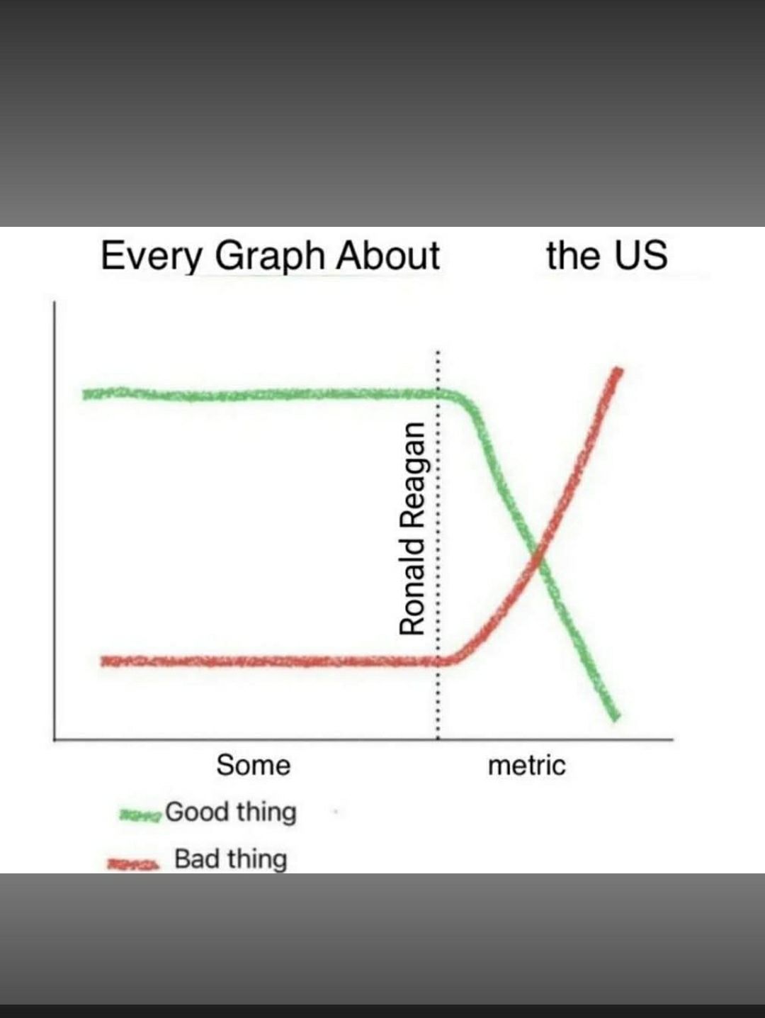
This meme critiques the idea that economic systems follow a natural, harmonious equilibrium where everything eventually settles into balance. In the graph, the red line—labeled "Bad thing" and the baseline for "Good thing"—represents this traditional Neoclassical view of stability, whereas the green line depicts reality as chaotic and unpredictable after Ronald Reagan's policies. By flipping the visual narrative so that the destructive outcome (the green drop) replaces the stable baseline, it argues against assuming that markets or economic policies naturally produce a correct or "natural" state of affairs.
detailed-analysis (gemma3_27b-it-q8_0)
Okay, let's break down this meme from an anti-neoclassical perspective, utilizing the requested theoretical frameworks where appropriate. Given the anti-neoclassical focus, we'll be emphasizing critiques of dominant economic narratives and the ways "objective" metrics mask power dynamics.
Visual Description
The meme presents a simple line graph. The Y-axis is simply labeled “metric” (leaving it intentionally vague), and the X-axis distinguishes between “good thing” (green line) and “bad thing” (red line). The green line starts relatively high and remains stable, representing a sustained “good thing.” The red line starts low and remains stable as well. A vertical dotted line, labeled "Ronald Reagan," signifies a turning point. After this point, the green line declines dramatically, while the red line increases sharply. The meme's title asserts that this graph pattern applies to "Every Graph About the US."
Foucauldian Genealogical Discourse Analysis
This meme is profoundly Foucauldian. It points to the construction of what constitutes "good" and "bad" through discourse, specifically in the context of US history and political economy.
- Discursive Formation: The meme critiques the ways specific metrics (left undefined, intentionally) are defined as indicators of societal well-being. This is not an inherent truth, but a historically contingent discursive formation. Before Reagan, certain things were commonly framed as "good" (e.g., union membership, social welfare programs, declining income inequality). The meme argues that after Reagan, the discourse shifted.
- Power/Knowledge: The "Reagan" point is key. It isn’t just a time marker, but the moment where a new power/knowledge regime took hold. Reaganomics (supply-side economics, deregulation, tax cuts) fundamentally reshaped the understanding of what was considered “good” for the US economy. Metrics like GDP growth, stock market performance, and entrepreneurial innovation rose in prominence, while measures of social equity and worker protections were downplayed or reframed as obstacles to growth. This isn’t about better data; it's about a shift in what data mattered and how it was interpreted.
- Genealogy of Morality: The meme is essentially tracing a genealogy of morality within the context of economic discourse. It’s saying that what the US considers "good" and "bad" has been historically constructed, and that the Reagan era represented a fundamental shift in that moral valuation. The red line's ascent isn't "naturally" bad, but is defined as such within a specific, critical perspective.
Critical Theory
The meme aligns strongly with Critical Theory, particularly the Frankfurt School's concern with the “instrumental rationality” of capitalism.
- Critique of Enlightenment Reason: The seemingly "objective" graph format – a staple of scientific rationality – is being used to demonstrate how rationality is deployed to legitimize unequal power relations. The very act of reducing complex social phenomena to a single metric is inherently a simplification that serves specific ideological interests.
- Culture Industry: The idea that every graph about the US follows this pattern suggests that there’s a systematic ideological bias embedded in how information about the US is presented. The culture industry (in the Frankfurt School sense) produces narratives that normalize and reinforce the dominance of the capitalist system.
- False Consciousness: The meme implies that many people accept the dominant narratives presented by the "good thing/bad thing" graph as truth, even though these narratives conceal the underlying power dynamics and the negative consequences of policies like Reaganomics.
Marxist Conflict Theory
This meme directly engages with Marxist conflict theory.
- Class Struggle: The "good thing/bad thing" lines can be interpreted as representing the interests of different classes. The pre-Reagan “good thing” might represent workers, unions, and social programs benefiting the working class. The post-Reagan shift signifies the increasing power of capital and the decline of worker protections. The “red line” represents the increasing consolidation of wealth and power in the hands of the capitalist class.
- Historical Materialism: The meme proposes a materialist interpretation of history – that the Reagan era marked a significant shift in the material conditions of life in the US, specifically a shift in the balance of power between capital and labor.
- Ideology: The graph itself is a representation of ideology. The dominant ideology (reinforced by media, education, and political discourse) presents a distorted view of reality that obscures the exploitation inherent in the capitalist system.
Postmodernism
While the meme’s format looks like objective data, its message is deeply postmodern.
- Deconstruction of Grand Narratives: The meme deconstructs the grand narratives of American exceptionalism and economic progress. The idea that every graph follows this pattern challenges the notion of a linear, inevitable march towards a better future. It rejects the idea of a single, objective truth.
- Relativism of Truth: The meme implies that “good” and “bad” are not absolute categories, but are defined relative to a particular perspective and historical context.
- Simulacra and Simulation: The graph itself becomes a simulacrum – a copy without an original. It's a representation of representations, and it critiques the way information is mediated and constructed.
In summary, the meme is a powerful critique of neoclassical economics and the dominant narratives surrounding US history. It argues that the "objective" metrics used to measure progress often conceal underlying power dynamics and serve to legitimize inequality. By exposing the constructed nature of "good" and "bad," it challenges us to question the very foundations of our economic and political systems. It’s a concise and visually compelling expression of anti-neoclassical thought.
simple-description (llama3.2-vision_11b)
This meme is a satirical critique of the Neoclassical economic theory, which is a school of thought that emphasizes the importance of free markets and individual self-interest. The meme uses a graph to illustrate the idea that the US is following a Neoclassical economic policy, with the x-axis representing "good things" and the y-axis representing "bad things". The graph shows a sharp increase in "bad things" as the US follows a Neoclassical policy, implying that the country is prioritizing individual self-interest over the well-being of the nation.
The text in the image reads: "The US is following a Neoclassical policy, which is good for the economy, but bad for the nation."