First Seen
2024-05-18T03:42:48.399541+00:00
simple-description (llama3.2-vision_11b)
The meme is an image of a graph showing the stock market performance of the S&P 500 and the Dow Jones Industrial Average (DJIA) in 2020, with the S&P 500 (blue) rising while the DJIA (red) falling. The caption "The Great Divorce" is written above the graph, with the subheading "Anti-Neoclassicalism" below it. The meme is poking fun at the idea that the S&P 500's strong performance in 2020 was due to a "great divorce" from the traditional stock market indexes, implying that the S&P 500's success was not due to the traditional stock market indexes, but rather a "great divorce" from them.
detailed-analysis (gemma3-27b-vision)
Okay, here's an analysis of the provided graph, broken down into sections addressing the requested theoretical frameworks, only where applicable. Note that some frameworks won't strongly apply, and I'll explain that when it occurs.
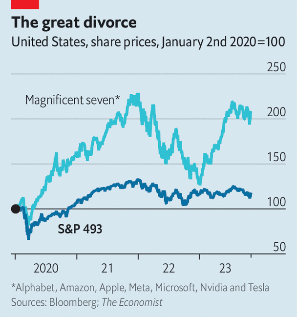
Visual Description
The graph depicts the stock performance of two groups – the "Magnificent Seven" (Alphabet, Amazon, Apple, Meta, Microsoft, Nvidia, and Tesla) and the S&P 493 index – from January 2020 through roughly late 2023/early 2024. The y-axis represents stock prices indexed to 100 in January 2020, while the x-axis indicates time.
Key observations:
- Divergence: The "Magnificent Seven" (represented by a blue line) significantly outperforms the S&P 493 (represented by a black line).
- Initial Growth: Both groups initially rose in early 2020, followed by a dip with the COVID-19 market crash.
- Widening Gap: The gap between the two lines begins to widen in 2021 and continues throughout the period. The Magnificent Seven exhibit greater volatility, but with larger gains.
- Recent Surge: The Magnificent Seven experienced a pronounced increase towards the end of 2023/early 2024, while the S&P 493 has remained relatively flat.
- Volatility: The Magnificent Seven stock prices show more volatility than the S&P 493 stock prices.
Marxist Conflict Theory
This graph is strongly amenable to a Marxist interpretation. The clear divergence in performance between the “Magnificent Seven” and the broader S&P 493 index exemplifies the core tenets of Marxist conflict theory.
- Class Struggle: We can see this graph as a manifestation of economic class struggle. The Magnificent Seven represents a concentrated, highly profitable sector (the bourgeoisie/owning class) accumulating wealth at a rate far surpassing the overall market (representing a broader economic base, perhaps the proletariat/working class). This isn't a literal class division within the stock market but reflects the broader imbalance of wealth accumulation.
- Capital Accumulation: The graph demonstrates a clear trend of capital accumulation – a central concept in Marxism. The Magnificent Seven are hoarding capital (profit) at an accelerating rate.
- Exploitation (Implied): While the graph doesn't explicitly show exploitation, the concentrated gains of these tech giants suggest a system where profit is derived, at least in part, from the labor and data of a wider population (the "proletariat") without equitable distribution of wealth. This is a common critique of the tech industry.
- Crisis of Capitalism (Potential): The dramatic divergence and concentration of wealth might be interpreted as a symptom of late-stage capitalism, where systemic inequalities become increasingly pronounced and potentially unsustainable.
Critical Theory
Critical theory, building on Marxist foundations but extending beyond purely economic analysis, also applies here.
- Power Structures: The graph reveals how power is concentrated within specific sectors. The Magnificent Seven aren't just successful; they dominate the market. This isn’t simply a matter of market efficiency; it reflects the power these companies wield in shaping consumer behavior, controlling information, and influencing political discourse.
- Ideology and Hegemony: The sustained growth and positive performance of these companies are often presented as natural or inevitable outcomes of innovation and market forces. This obscures the underlying power dynamics and justifies the existing inequalities. This is a form of ideological control.
- Commodification: The focus on stock prices and market performance reduces everything to a quantifiable commodity, obscuring the social and ethical implications of corporate practices (data privacy, labor conditions, etc.).
- Reason and Domination: The rational pursuit of profit and market share by these companies, while seemingly logical, ultimately reinforces a system of domination and inequality.
Foucauldian Genealogical Discourse Analysis
A Foucauldian approach examines how the discourse surrounding these companies shapes our understanding of success and economic value.
- Power/Knowledge: The graph itself is a form of power/knowledge. It produces a particular narrative about the economy, framing the Magnificent Seven as exemplars of successful investment. This shapes perceptions and justifies existing power structures.
- Disciplinary Power: The constant monitoring of stock prices and the pressure on investors to maximize returns create a form of disciplinary power, forcing individuals to conform to the demands of the market.
- Genealogy of Success: A genealogical analysis might trace the historical development of the concept of “success” in the context of the stock market. How have definitions of success changed over time? What power structures shaped those definitions?
- Normalization: The graph normalizes the idea that such extreme concentrations of wealth and market dominance are acceptable or even desirable.
Postmodernism
Postmodern analysis is less directly applicable, but some points can be made:
- Simulacra and Simulation: The graph can be seen as a simulacrum of economic reality. It’s a representation that’s removed from the lived experiences of most people. The focus on abstract numbers (stock prices) obscures the real-world consequences of economic policies.
- Deconstruction of Value: Postmodern thought questions the very notion of “value.” What does it mean for a stock price to increase? Is it a measure of genuine wealth creation or simply a form of speculation?
- Fragmented Narrative: The graph presents a fragmented narrative of economic performance. It focuses solely on these seven companies and ignores the broader economic context.
Queer Feminist Intersectional Analysis
This framework is the least directly applicable, but some considerations are:
- Lack of Representation: The Magnificent Seven are largely led by white men, highlighting a lack of diversity in positions of power and wealth accumulation. The graph implicitly reinforces this existing imbalance.
- Intersection of Oppression: The wealth accumulated by these companies may be tied to exploitative labor practices and data collection methods that disproportionately affect marginalized communities.
- Gendered and Racial Capitalism: Exploring how systems of capitalism intersect with gender and racial inequalities to create patterns of wealth accumulation and exploitation.
In summary:
The graph is a powerful visual representation of economic inequality. It's particularly well-suited for analysis through Marxist and Critical Theory lenses, revealing patterns of class struggle, capital accumulation, and power concentration. Foucauldian and Postmodern perspectives offer insights into the ways in which this data is produced, interpreted, and normalized. While Queer Feminist Intersectional Analysis is less direct, it can highlight the lack of diversity and potential for systemic oppression embedded within the broader economic context.
simple-description (llama3.2-vision)
The meme is a chart showing the performance of the S&P 500 (blue) and the Dow Jones Industrial Average (DJIA) (orange) from January 2020 to January 2023. The chart is titled "The Great Divorce" and the text at the top reads "S&P 500 vs. Dow 500". The chart shows a massive divergence between the two indices, with the S&P 500 (blue) skyrocketing while the Dow 500 (orange) is stagnant.
tesseract-ocr
Le The great divorce United States, share prices, January 2nd 2020=100 250 Magnificent seven* 200 150 100 S&P 493 50 CT To 2020 21 22 23 *Alphabet, Amazon, Apple, Meta, Microsoft, Nvidia and Tesla Sources: Bloomberg; The Economist