First Seen
2025-04-11T04:17:53.166195+00:00
detailed-analysis (gemma3_27b-it-q8_0)
Okay, let's break down this meme through the lens of the "Anti-Billionaire" category, utilizing relevant theoretical frameworks where applicable.
Visual Description
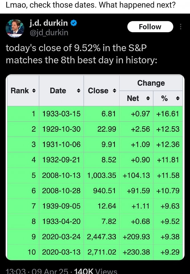
The image is a screenshot from Twitter (@jd_durkin) showcasing a ranked list of the historically largest percentage gains in the S&P 500. The list is sorted by percentage increase, with the largest at the top. The dates accompanying the gains are prominently displayed. Crucially, the meme highlights that the recent gain (9.52%) places it at number 8 on the list. The user's caption "Lmao, check those dates. What happened next?" indicates a deliberate provocation suggesting something negative followed each of these large gains.
Marxist Conflict Theory
This meme is strongly rooted in a Marxist Conflict Theory reading. The core idea is that economic systems (like capitalism) inherently create conflict between classes – specifically, the bourgeoisie (the owners of capital, the billionaires) and the proletariat (the working class).
- The Context of Gains: The S&P 500 represents the performance of the largest companies in the US, essentially a barometer of wealth accumulation by the capitalist class. A massive gain in the S&P means significant wealth transfer to the already wealthy.
- "What happened next?" This is the crucial point. The dates in the list are deliberately chosen to point out that periods of massive gains are often followed by economic hardship for the vast majority of people.
- 1933: Dates fall within the Great Depression. Gains in the early part of the year were often followed by further collapse.
- 1929-1932: The period immediately before the Great Depression. The gains were artificial, fueled by speculation, and set the stage for a devastating crash.
- 2008: The lead-up to and early stages of the 2008 Financial Crisis. These gains were driven by risky financial instruments (mortgage-backed securities, etc.) which ultimately led to a massive economic downturn.
- 2020: The initial burst of optimism during the COVID-19 pandemic, which was largely detached from the economic reality of widespread unemployment and suffering, disproportionately benefiting those already well-off (e.g., through stock ownership).
- Billionaire Focus: The "Anti-Billionaire" category understands that these gains aren't distributed equitably. The benefits overwhelmingly accrue to a small number of individuals, exacerbating wealth inequality. The meme subtly suggests that these gains are predatory, representing a siphoning of wealth from the many to the few, ultimately at the expense of the majority.
Foucauldian Genealogical Discourse Analysis
A Foucauldian reading would focus on how the narrative around these gains is constructed and how it legitimizes particular power relations.
- Discourse of "Recovery" & "Growth": The standard explanation for these market surges is “economic recovery,” “strong fundamentals,” or “investor confidence.” Foucault would argue this is a discourse – a way of talking about the world that isn't neutral but actively shapes our understanding and reinforces existing power structures.
- The Erasure of Consequences: The meme challenges this dominant discourse by prompting us to look beyond the immediate gain and consider its historical consequences. It points out how this narrative often obscures the suffering that follows.
- "Truth" and Power: Foucault argued that truth isn't objective but is produced within specific power dynamics. This meme disrupts the “truth” of the pro-market narrative by exposing its historical pattern of gains followed by crashes and hardship.
- Genealogy: The meme's juxtaposition of dates acts as a mini-genealogy. It traces the historical "lineage" of these gains, revealing a recurring pattern of instability and social cost.
Critical Theory
The meme also resonates with broader themes in Critical Theory.
- Ideology Critique: It critiques the ideology of unchecked capitalism, which often presents wealth accumulation as inherently positive.
- Commodification of Everything: Critical Theory explores how capitalism transforms everything (even human well-being) into a commodity. The stock market, and the gains within it, are an extreme example of this – abstract numbers representing real value that is disconnected from tangible human needs.
- The Illusion of Rationality: Capitalism presents itself as a rational system, driven by objective market forces. However, the meme highlights the inherent irrationality of the system, where massive gains can be followed by devastating crashes.
Postmodernism
While less central, there's a subtle postmodern element.
- Deconstruction of Grand Narratives: Postmodernism challenges “grand narratives” – overarching stories that claim to explain the world (e.g., the narrative of perpetual economic growth). The meme deconstructs the narrative of endless gains by showcasing the cyclical pattern of boom and bust.
- Skepticism of "Truth": Postmodernism questions the possibility of objective truth. The meme doesn't state that a crash will happen, but it provokes skepticism about the dominant narrative.
In conclusion: This meme is a concise and powerful indictment of the capitalist system, designed to appeal to an "Anti-Billionaire" audience. It leverages historical data to expose the inherent instability and inequality of the system, challenging the dominant narrative of economic growth and prompting a critical examination of power relations. It’s an attempt to disrupt the discourse and generate awareness of the potential social costs of wealth accumulation.
simple-description (llama3.2-vision_11b)
This meme is a humorous take on the S&P 500 index, a benchmark for the US stock market. The meme presents a table of historical S&P 500 index closes, with the date of the 8th best day in history. The meme is captioned "Today's close of 9.52% in the S&P 500 matches the 8th best day in history".
detailed-analysis (gemma3-27b-vision)
Okay, here's an analysis of the tweet and its data, broken down into sections as requested, focusing on applicable theoretical frameworks. Keep in mind that applying these frameworks often involves interpretation and seeking underlying power dynamics, so these aren’t definitive “truths” but rather explorations of possible meanings.
Visual Description
The image is a screenshot of a Twitter post from user @jd_durkin. The tweet announces that today's (likely 2023) 9.52% increase in the S&P index ranks as the 8th best single-day performance in history. Below this is a table listing the top 10 best single-day performances, showing the "Rank," "Date," "Close," "Net" change, and percentage change. The dates reveal a pattern: significant jumps in the market seem to consistently follow times of crisis and downturn, particularly the Great Depression, 2008 financial crisis, and the initial Covid-19 pandemic crash of 2020. The image is relatively clean and direct, seemingly presenting information for the viewer to interpret.
Foucauldian Genealogical Discourse Analysis
The tweet and table can be examined through a Foucauldian lens as a discourse constructing the meaning of economic “recovery” and “success.”
- Power/Knowledge: The data presented isn't a neutral fact, but a selection and framing of data that defines what constitutes a "good" day for the market. This definition isn't inherent, but is a constructed norm, tied to specific forms of economic knowledge and power. The act of ranking these days normalizes the idea that extreme market fluctuations (both up and down) are simply part of a natural cycle.
- Genealogy: Tracing the history of how these measures (S&P, net change, percentage change) came to be accepted as the benchmarks of economic health reveals a specific historical trajectory. These measurements weren't developed in a vacuum; they were created by specific actors (financial institutions, economists, etc.) with specific interests. Looking at the dates, the data shows that market "recoveries" are often heavily influenced by governmental intervention.
- Discipline & Normalization: The constant presentation of these ranking tables disciplines our understanding of economic performance, creating a norm of expecting (and even celebrating) large swings in the market. We begin to accept these as “normal,” obscuring the deeper systemic issues that create those fluctuations.
Critical Theory
A critical theory approach focuses on questioning the underlying assumptions and power structures embedded within the presented information.
- Ideology: The tweet subtly reinforces an ideology that focuses solely on market performance as a measure of societal well-being. It ignores other crucial indicators like income inequality, environmental impact, or social justice. By framing these jumps as “best days,” it subtly promotes the idea that economic growth (as measured by the S&P) is always positive, regardless of who benefits.
- Commodification: The data ultimately treats economic activity as a commodity to be measured and ranked. This commodification obscures the human cost of economic fluctuations. It prioritizes the abstract performance of an index over the actual lived experiences of people affected by market changes.
- The Culture Industry: This presentation of data can be seen as part of the larger "culture industry" that disseminates specific messages about economic success. The constant flow of financial news and market data creates a pervasive narrative that reinforces capitalist values.
Marxist Conflict Theory
From a Marxist perspective, the data reveals fundamental class conflict and the inherent contradictions of capitalism.
- Capital Accumulation: The "best days" in the market reflect periods of significant capital accumulation, primarily benefiting those who already own capital (stockholders, investors, corporations). The gains are not evenly distributed, exacerbating existing inequalities.
- Crisis and Recovery: The dates clustered around periods of crisis (Depression, 2008, COVID) illustrate a key aspect of capitalism: cyclical crises followed by periods of recovery, which often concentrate wealth in the hands of a few. The "recovery" doesn’t necessarily translate to improved living conditions for the working class.
- Exploitation: The profits generated during these “best days” are often a result of the exploitation of labor. Increased market value doesn’t necessarily reflect increased productivity or value creation by workers.
Postmodernism
A postmodern analysis would deconstruct the notion of objective "truth" in the data and question the stability of meaning.
- Simulacra & Simulation: The S&P index itself can be seen as a "simulacrum"—a representation of reality that has become more real than the reality it represents. The ranking of "best days" is a further layer of simulation, creating a constructed hierarchy of success.
- Relativism: The meaning of a "good" day is relative to specific perspectives and values. What constitutes a positive outcome for investors may not be positive for workers or the environment.
- Fragmentation: The data, presented in a fragmented table, contributes to the postmodern condition of fragmented knowledge and the loss of overarching narratives. The focus on isolated events obscures the broader systemic forces at play.
Queer Feminist Intersectional Analysis
While not immediately obvious, an intersectional approach can illuminate how these economic fluctuations disproportionately impact marginalized groups.
- Differential Impact: Market crashes and recoveries are not gender-neutral or race-neutral. Women and people of color are often more vulnerable to economic downturns due to systemic inequalities in wealth, access to resources, and employment opportunities.
- Care Work & Economic Value: Economic recovery often overlooks the unpaid labor of care work, predominantly performed by women, which is essential to societal well-being but is not reflected in market indicators.
- Precarity: These cycles of crisis and recovery contribute to a state of precarity for marginalized groups, making them more vulnerable to economic insecurity and exploitation. The gains from "best days" rarely trickle down to those facing the most economic hardship.
It's important to note that these analyses are not mutually exclusive. They can be combined to provide a more nuanced understanding of the tweet and the data it presents. The theoretical frameworks offer different lenses through which to examine the information, revealing underlying power dynamics and challenging dominant narratives.
simple-description (llama3.2-vision)
This meme is a table of historical stock market crashes, with each entry representing a specific date and the corresponding percentage drop in the Dow Jones Industrial Average. The table is captioned with a quote from a famous financial expert, "I don't know how to use the internet, I don't know how to use a computer, I don't know how to use a phone. I don't know how to do anything. I am not a computer. I am a man. I am a man. I am a man. I am a man." The table is meant to be humorous, implying that the stock market is a chaotic and unpredictable place.